Done.
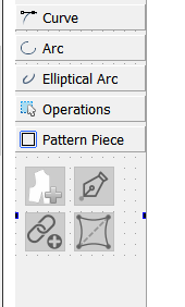
I can move the Elliptical Arc tool to the Arc tab… but like I previously stated - if I end up adding more Elliptical arc tools, I might want to move it back.
Done.

I can move the Elliptical Arc tool to the Arc tab… but like I previously stated - if I end up adding more Elliptical arc tools, I might want to move it back.
Well putting the 3 mode toolboxes in a QStackedWidget works like a charm. Real easy to swap to the correct page in the QStackedWidget when switching modes. Still can’t seem to get the Toolbox tab text labels to expand when resizing the Dock… quite odd. Theoretically I’d like the tabs to expand if for ex one switched to a larger font or set the screen resolution to 125% or 150%… which should expand the QToolbox which should expand the QStackedWidget which should expand the QDockWidget without the tab text eliding.
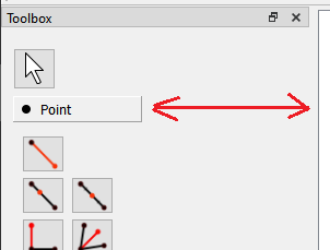
Anyhow… Just have to resolve a minor issue. Since moving the toolbuttons around and deleting some of the arrow pointer code, the behavior on some of the tools has changed - which IMO might be one of those good accidents - that is the Toolbox stays on the current tool, instead of switching to arrow. I would find it quicker to stay on the same tool, until you WANT to switch, or need to go to the Arrow Pointer. Opinions?
My vote would be yes. Other imaging software do this, too, and I’ve often wished that Seamly does, especially when drawing in lines between nodes ![]()
The only possible drawbacks I see are
So, with those caveats which I assume won’t be an issue, (but you know what they say about making assumptions,) I agree with Grace. Yes, this would be a step forward.
Sorry for the confusion, yes I mean the toolbars and I know they can be enabled and disabled, I was talking about on the default configuration. When you first open the program it is super overwhelming because literally every tool in the side toolbar is at the top as well, so it is just information overload if you don’t know what all of that is.
As far as making the sidebar shorter, my comment was not meant to be read as something you should do, it was meant to point out an additional benefit to what you already were doing. Hiding some of the top toolbars would have this effect of making the window shorter as well. I just wanted to point it out because the window being so tall is kind of a problem, so if the layout is being redesigned, giving some preference to design choices that shorten the height makes sense.
So, to be clear, I agree with the redesign you were doing, and hope you will take the same approach to the top toolbars that you have on the side bar. (Hiding the ones not relevant to the current mode)
Yes, I hear this feedback often when teaching newbies. The top bar is unusable by newbies and it puts them off a bit, but its great for experienced users.
I don’t see this one as a problem.
The tools behave exactly the same whether called from the toolbox, menus, or toolbars. They are all connected to the same handler for that tool. So again this should not be a problem.
The only problem I forsee… is if a user hid the Toolbox and all the Tool toolbars, and for some reason was just using the menus or keyboard shortcuts. There would be no visual Arrow… although hitting the Esc key triggers the Arrow pointer. I believe switching modes also triggers the Arrow.
Again… the “draft mode” toolbox will already be shorter by 2 and 3 pages if I move the Elliptical arc. I’m also trying to put the toolbox in a QScrollArea, which would present scroll bars if you really shorten the main window. At least that’s the idea. The form layouts can be finicky.
I think I can probably hide the tool toolbars as a default… not to be confused by the Dock on the left side. If you want you could move ALL the toolbars to the leftside, top, bottom, or rightside… that’ why I’m specific when I refer to the “Toolbox” dock which can also be move elsewhere or float.
Anyhow. Since toolbars (currently) don’t have to be on a fixed position, there might an issue with hiding certain toolbars when switching modes… and making the toolbars fixed defeats the purpose of being able to configure them. Frankly it would drive me nuts if the toolbars kept moving around. It would be like if the strings on your guitar kept moving.
That being said… Ideally it would great if we could have ONLY the current tool group tookbar - like points - dynamically appear on a bottom row of top position toolbars. The problem here is the way Qt handles the toolbars in the context menu, where it automatically adds toolbars and docks to to the drop down… a user could enable or move another toolbar and throw the whole idea out the window. I would probably have to bypass the Creator UI and code all the toolbar and dock widgets by hand to be able to have control over them… just like the Widget factory in LibreCAD.
Ahh, good point about the toolbars at the top moving around, I hadn’t considered that. It probably makes that a lot trickier then and is therefore probably more trouble than it is worth.
I think if I disable the tool toolbars in Creator (uncheck the enable box), they will default to hiding in a new install. I’ll find out later tonight. If that doesn’t work might have to resort to hiding them via code in a “first use” splash screen.
Ok… here’s what I got. Moved the Elliptical arc tool to Arc’s page:

Now in order to hide the tool toolbars with a new install, I had to add some checkboxes to the settings. Since with a new install there is no settings ini file yet, by adding the checkboxes I can force the settings to write a default of OFF. Which basically is a way to override the UI geometry state settings - which default to ON for toolbars with an empty settings ini file. So now there’s another option to toggle the visibility of a tool group toolbar.
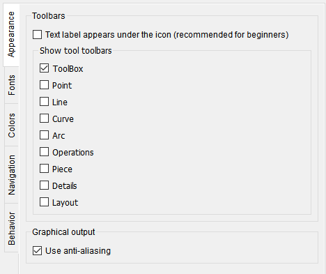
That looks awesome. Kind of sad it didn’t make it into this weeks build but I am looking forward to the next build that comes so I can try it all out.
Should probably be in next weeks.
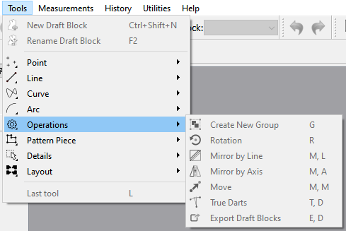
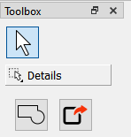
Ok… I think I finally finished up this issue. Decided to fix the syncing of the Arrow pointer between the Toolbox and Toolbox_toolbar, as well as updating the toolbox page icons, and the Layout icon.
So… here’s the Draft toolbox with the page icons now matching the Tools menu & Toolbox_toolbar icons.
Draft toolbox:
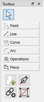
Tools menu:
Toolbox toolbar:
![]()
The Piece toolbox:
and the Layout toolbox:
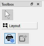
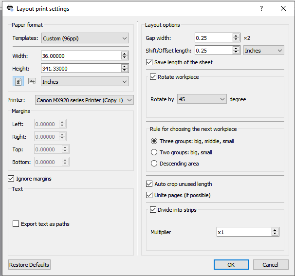
Note the new icon for the New Print Layout (Layout print settings) toolbutton:

which also now appears in the dialog (as well as the Tools menu & Layout toolbar)…
Wow! That looks really awesome. Thank you very much, @Douglas 
I’ve been working with this ‘new look’ toolbox and it is really awesome. So much cleaner and user friendly.
However, I have another 2 suggestions for discussion. Both in the Line section…
The 1st the Intersect two lines tool. To my mind, this belongs in the section above, since it actually creates a point (node) and is often overlooked by users wanting to create a node at the centre of 4 other nodes.
Which brings me to the 2nd suggestion… If that tool is moved, it will leave the Line tool all on its lonesome in a whole section just for it. And since it is actually an annoying but necessary tool, required often during pattern making to make a line to use in formulas (among other things), wouldn’t it be more practical to place it outside of the toolbox next to the Tool Pointer?
It’s also cleaner code wise. It was clunky with having to swap a list of pointers instead of just using 1.
I’ve often thought of that myself, but then by that logic most of the curve and arc tools should move to the Points page, as they tool produce only a point.
To be honest, I’m happy with where it is, and like the Elliptical arc, I can see adding other (line) tools in the future. Doesn’t make much sense to remove pages in the toolbox only to add them back later.
Ok, it’s only suggestions. I’m really happy with all the tidying up that you’ve done. It really does work much easier than before, so I look forward to all the new changes in future 
![]() Yes I agree with all your reasons for this @Douglas
Yes I agree with all your reasons for this @Douglas