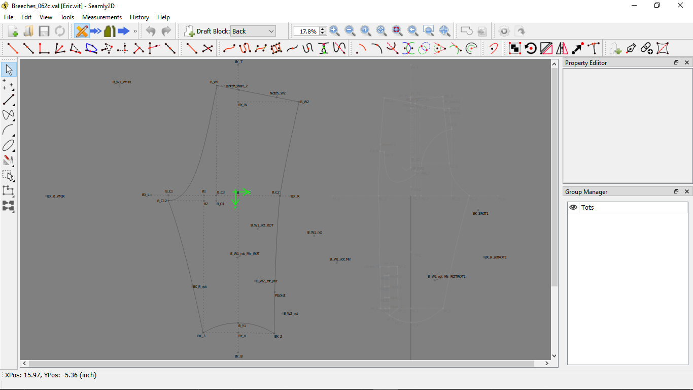
This is based on the Debian Linux VM on Chromebook.
The toolbar is off to a good start! (it doesn’t crash all the time )
However, since I’m away from my big screen these days, there were a few needed tweaks that I noticed.
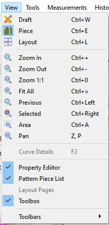
The zoom toolbar doesn’t collapse like the rest of them. It should.
possibly the zoom to selected should be on top
The File menu toolbar should have Save on top, not New.
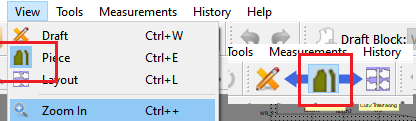
The draft → piece → layout arrows don’t make any sense when the Mode toolbar is collapsed. Possibly the current view should be hilighted/circled instead.
would it be difficult to make the current mode be the one showing on the icon?
The Pattern Toolbar should have the block selection drop-down on top.
In the toolbar selection menu, I feel like the menu-name toolbars should be (1) grouped together, (2) in the same order as they appear in the menubar.
It might also be nice to be able to access the full bars by long-clicking the visible icon, not just by the drop-down arrows.
I think that’s all that affected my ability to use the toolbar effectively on this small screen. (though 5 is broader in application, but also less intrusive in daily use)
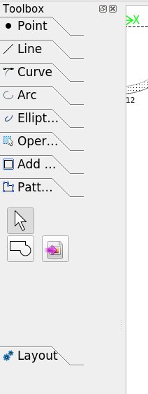
There’s also one thing with the toolbox. The labels on the boxes don’t fully show, & when I widen the toolbox field, nothing changes. Possibly it would be good if the buttons separated a skosh, but definitely the labels should show more completely. As it is there’s absolutely no reason for the ability to widen the toolbox.
Anyway, the concept is off to a great start, but those are the things that I think are most important to make it everything it is supposed to be. I was able to get it set up in a way that works for me, but at the expense of the Zoombar. It might also be nice to have a different toolbar setup for each mode, no point showing closed bars.
Finally, thanks for all your hard work! I really do appreciate it!
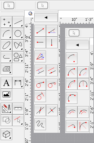
First I will note that one can choose which Toolbars and Dock widgets are visible, and that you can choose which dock location to dock them. Toolbars can also be stacked. The default setting when first installing the app is the toolbars are collapsed. You can drag them around, open them up, hide them, or dock them else where. For ex the screencap below show the Toolbox dock hidden, the Toolbars on the top dock location are stacked in 2 rows, and the Toolbox toolbar is docked at the left hand location - my preferred setup since I’m used to Corel Draw flyouts. The Toolbox Dock takes up too much space.
That being said - I’m a little bit confused, but I’ll take each item 1 at a time…
Are you’re referring to this in the View menu"
Yes… you could place all the Zoom items in a submenu, but it goes against the normal Windows guidelines of NOT placing frequently used commands in a submenu.
" Do not place frequently or repetitively used commands on a cascading menu, where they will be more difficult to locate.
As an alternative to a cascading menu, you can make choices available in a secondary window, particularly when the choices are independent settings; this allows the user to set multiple options with one invocation of a command. You can also represent common commands with buttons on a toolbar"
If and when the View menu were to get longer at that point I would place the Zoom commands in a sub menu. It is also common practice to show Zoom In / Zoom Out as the top 2 menu items.
Or are you referring to:
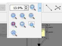
Which clearly shows the Zoom toolbar collapsed and dropped down to show the tool buttons.
Standard order for “File” menu items is New…, Open…, Close (if used), Save, Save as…, Print.
Again… I don’t get the “toolbar is collapsed”? Am I missing something?
Here’s the Menu and Toolbar showing the “Piece mode” selected…
and when the toolbar is collapsed and dropped down:
Probably… but it would be easy to make the toolbar non collapsible.
6 of one, 1/2 dozen of the other. IMO… configure the Toolbars - open up the Toolbars you want to use and hide the rest.
Agreed… that order could be changed in the View->Toolbars->[items], except there are some Toolbars that don’t have a matching menu in the menubar - Mode being one of them. What can’t be changed - without overriding the Toolbar class - is the order the Toolbars display when using the right mouse button Context menu. The Docks always show at the top, followed by the Toolbars in I guess what ever order they were created?
How? If you click the showing tool button THAT action will be executed. That’s why the arrows are there. Again… IMO just configure the toolbars to show the whole toolbar.
Well this is more a preference and shouldn’t need to change much once you figure out which Toolbars you prefer to use.
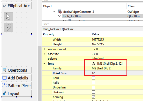
Again probably related to the fact that your system is using a larger font. Which I still don’t understand how it can be overriding the font size set for the widgets in the forms. Even if I increase the font size to 12 from 8 it still fits: ???
I could try and reconfigure the Toolbox to expand with the dock size. What would be a better solution is if there was a way to detect and adapt the UI forms to the font being used.
This would be relatively simple to do… as it is the Toolbar tools all have to be set enabled / disabled depending which mode you’re in. Instead of setting the enabled state, could just set the visibility state instead. If it’s not visible it’s in essence not enabled.
Let’s see where I am now. After a bit more banging around, I finally discovered exactly what the hand cursor was showing me. I’m not sure if the reason I hadn’t before was that my system is a bit unstable & wouldn’t work it, (this is verified as possible,) or if I was happy with the ordering of the toolbars & so didn’t think to poke around in that direction.
The move/re-size hand-hold system is annoying. Which I don’t doubt is an insult to Adobe. My idea is for the toolbars to have resizing arrows like most windows do these days, but I’m not sure it’s worth the code. It is only a temporary annoyance, which can be borne until refinement is achieved. 'twould be nice though.
It’s working properly now. I think since it was near the left of the screen it wasn’t re-sizable, since the only other thing on the left was undo/redo, & it was probably prioritized in the creation process. There hadn’t been the open arrow. & also the problem with my unstable Debian VM.
Yes, but when the toolbar is collapsed because it doesn’t have enough room, it needs to be able to have Save showing, because you are more likely to be saving in the normal course of drafting on a computer than making a new file. Though I do typically find it more convenient to ^s. Oh! doodling around a little, I recall that the biggest reason I like the Save button showing is that it reminds me when I need to, & reassures me when I don’t.
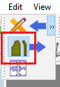
Okay, now I see the slight hiliting, but the arrows distract from what’s going on here.
…I’d better figure out how to screencap on this computer, hadn’t I?
Here’s a screenshot of what I’m seeing, with the dock slightly widened:
There is a decent chance that I’ll replace it with the toolbar, as you do.
Thank you for helping me discover that the worst of the problems I was having were (probably) caused by my system rather than by Seamly!
Oh! one thing that might need moved is that “Point at Distance & Angle” is the second option in the point drawer of the “Toolbox ToolBar”. I think it should be the first, as it is in the regular toolbox.
Nothing I can do about that - short of reimplementing the QToolbar class… The only solution would be to allow a user to create custom toolbars, and you could place tool buttons in any order you’d want. It’s something I’ve considered, but there’s a heck of a lot more the app needs first before the toolbars.
Oh yeah… I forgot - that’s that weird Linux take on the QToolbox label buttons. I don’t get it… but I can only assume this has always been an issue since the Toolbox previously was fixed in size? I tried to take a look again on my laptop with Ubuntu running off the USB, but I can’t figure out how I got the appimage to run again. ?? I also tried to switch the QToolbox pages to expand, but wasn’t having any luck. I’ll keep trying to figure out something.
It’s possible I could redo the toolbox to do something more like QCAD handles the tools…just eliminate the QToolbox with page->text labels.
That’s simple enough… just need to swap buttons on the form.
BTW… because I’m about to check something in an older Seamly2D…
WARNING: If you use another (older) version of Seamly2D - due the fact that any ver of Seamly2D looks in the same folder for the same preference ini file – all the docks and toolbars revert back to the initial (collapsed) or hidden state when you open the newer app again. You’ll also loose prefs like all the colors that don’t exist in the older ver. I’m just use to dragging the toolbars around and resetting colors, etc… bouncing back and forth between versions of the app. Don’t know if it would be useful to the avg user, but for someone like myself it would be useful to able save and load multiple configurations
I hadn’t noticed it before. Let’s see… in the 20201026 I can see “Elliptic…” Whereas in the 20201207 I can only see “Ellipt…” & the “Detail” tab being renamed “Add Details” I can only see “Add …” So I’d say the fixed size is a tad smaller, & the (welcome) renaming made it even more alien, but I think it’s mostly the reduced space on the left which made the shrunken labels really stick out. We could blame it on me being raised on the Great Plains.
Try going to its location in the Terminal, & entering ./Seamly2D.AppImage. You also might have to enter chmod +x Seamly2d.AppImage to make it eXecutable, that should make it be so that you can load it from its icon. Beyond that, I’m not sure what your options would be.
Thanks for the warning! I’ll close my older copy first & see if that saves me grief, otherwise I guess I’ll just get extra practice juggling toolbars!
heh, yeah, it would probably be most helpful to geeks, devs, & support. It sounds quite helpful.
Yeah… sounds like it’s an existing issue given using a larger (system) font in Linux. If I can figure out how to get the Toolbox widget placed in a layout the pages / labels might be expandable. Thing is by the time you’re able to expand the toolbox enough to see the whole label, you’re going to loose another 10-15% of the workspace. Then again I can relate to using a larger font as it getting harder for me to see the screen without my glasses on.