A method to "walk the seams" and check seam lengths

Although a dedicated block for the use would be a lovely short-term solution, I do think that the dock is where it should eventually end up.

I think that rather than giving it space in the tool box, it should have a + button like the Group Manager. For each entry I’m envisioning a properties dialog, which has two fX boxes. If the boxes are populated with line/curve type objects, the lengths will be compared, but if the boxes are populated with points, the panel will display the distance between the two points, & the angle from point A to point B.

As you said, “spit balling”, this is what I’m envisioning based on the discussion at the moment.

:unicorn:

1 Like

Agreed. It certainly would be a lot easier to implement a block MACRO vs another dock widget, but in the long run having the functionality in a dock would be more robust.

I like that idea.

One thing we’d have to figure out is being able to add Points with the FX wizard. Also, the problem I see is that most point tools ARE the line.

1 Like

More spit balling… another thing one might want to “check” is the perimeter of something… like say a collar… or the length of an internal path. Maybe you need to know how much trim you need.

1 Like

Exactly that.

Yes, you never know when you want to add the odd inch or 2.

Or the angle between 3 points. I can’t tell you how many times, I’ve sat with my phone against the screen, with the spirit level app, checking things :rofl:

Yip! It’s good to get a clear idea of what it can do to get the most out of it before even thinking about the programming.

1 Like

That would be easy with the seam length check, one would have the formula in while the other would remain 0.

1 Like

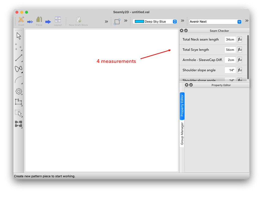
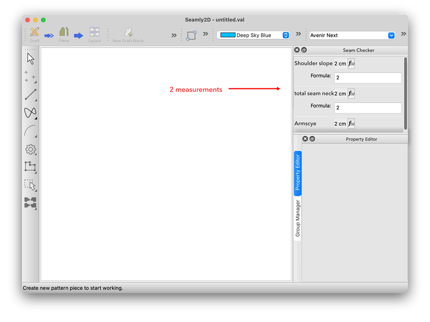
If you have also the formula box always shown, while you can add the odd inch or two faster, you basically lose half the number of “comparisons” that can be shown at the same time, unless you have a big monitor.

IMO the compromise (since it’s a tool to check measures, while designing with other tools) would tend to go towards seeing more measurements. Adding the odd inch is just a click on the Fx button away.

compare the following, which are built using screenshot parts, all at the same scale:

With this:

Of course you can reduce the Property Editor, but showing the formulas will always eat more useful space


But wouldn’t this solution eat precious vertical space?
2 Likes

Yes. In the same way that a hammer’s handle is always getting in the way. To maximize usefulness the two parts have to be kept together. OOH! But if (unlike Groups) the add button was part of the scrolling area?

:unicorn:

1 Like

I’m not convinced the metaphor applies here, and by the same logic you would get rid of the Add object To group tool. and keep it together in the Group manager… BUT!

I like that (anso for the group manager)

2 Likes

It would be another dock window… you can tab it just like the Properties Editor, Groups or Layouts… you have the full height of the dock to work with. The app rememebers the state and sizes of the dock widgets when starting the app in the future.

That’s there as a legacy behavior. It could go or stay… doesn;t matter to me.

1 Like

I just threw this together as a general thought on a Check’s dock window.

Top of the dock would be a set of toolbuttons… here I quickly made icons for Match a Seam, Check perimeter, Check Length, and Check Angle.

My idea would be to create a widget that displays and handles each particular type check. For ex: I did one for the seam check… which would have formulas for the 2 seams, would display the calculated length of each, and also display the difference. Each type of widget woud display an expand / collapse button, the name of Check, and a delete button. I didn’t show it here, but the dock just like the others would contain the layout withing a scroll area, so if the number of Checks is greater than the current dock height the scroll bars appear. Again, since it’s just another dock window, when it’s docked the tab appears so you can switch between docks. This allows the full height of the dock area… I probably would add the type of check icon in front of the Check name just to identify what type of check it is. The trashcan button may be superflous, as delete could probably be in a context menu.

check_dock

2 Likes

It looks really good to me :grin: Thank you very much :star_struck:

Well… it’s just a start. Again I’m just spit balling. :slight_smile: Creating a ui form is the easy part… writing all the code to handle the data to fill and edit the form is the hard part.

2 Likes

looks nice!

some thought:

What id in your mockup example I want to compare one bodice side seam with another measure? Would the second formula be called Seam2 in any case? Or would you need to use another widget?

Wouldn’t be more flexible to decide in the formula what kind of check is being done?

At the end of the day Match a Seam, Check perimeter, Check Length, and Check Angle are just the final result of a calculation that you write in the formula dialog. They are basically the same thing. What I mean is that you construct the formula of what you want to check and give it a name that would appear as the widget name.

Check perimeter of Neck:

  • formula: length of front neckline + back neckline
  • name: Neck total lenght

I’m worried that a structure of widget too strict and granular would lead to confusion.

One example that would’t fit in this structure is something I just added to the dashboard I posted at the beginning of this thread: A formula to approximate the final neck opening (after applying the ribbed neckband) starting from the total lenght of the neck opening in front and back bodices:

this is the formula:

Basically I’m calculating the internal circumference taking into account the seam allowance and the height of the neck band.

1 Like

No. Each type of check would have it’s own widget. I just did an example of checking 2 seams. For a perimeter - or maybe a better term would be path or contour - only 1 formula box and length calculation would be required. For a length comparison there would be 2 points and a length calculation. And so on for whatever other checks we would want.

The dock would be a dock container in a vertical Layout. The check tool buttons within the dock container as a horizontal layout. Then a scrollarea widget that would contain a tablewidget (or maybe just a listwidget) . When you click one of the tool buttons it adds that check type’s widget to the next tablewidgets row / cell. This way it’s easy to add any new type of check as alll that’s mainly needed is a new button icon and the check type widget. Most of the details of the check type is handled within the type’s widget class. It’s a modular way of creating forms… where you’re just nesting widgets within widgets within widgets. Pretty much everything you see in the UI is a widget… or Object if it has signals & slots attached.

Would depend on the what the check type is. Finding a length between 2 points needs 2 points, not a formula. Checking an angle may need 3 points. Maybe an option to pick which angle as there will be 2.

As far as the name goes… I can see just setting the type widget’s name text to a sequential default value. For examlple Seam Check 1, then Seam Check 2… and the name would be editable with a double click on it. I think we can dispense with having a dialog popup just asking for a name of the new check. Probably should note that technically we would be checking “One” seam… maybe the labels Side 1 and Side 2 would be bettter rather than Seam 1 and Seam2?

And looking at your screencap… since you’re showing 3 different neck length calculations… that could be done with the Perimeter (Path / Contour… whatever the decided term is). You would just add the same formula you have now for each one. So now instead of having 3 lines of objects in some draft block, there would 3 Check Length widgets in the Check’s doc. BTW… I would think too the whole idea of moving this to a dock would be a benefit to the performace of the app as those neck lines don’t have to constanly be redrawn everytime the pattern is reparsed - which happens all the time.

2 Likes

Maybe this will be clearer…

dock2

3 Likes

I guess we are all waiting for this new toy to arrive to start playing with it!

1 Like

Can you include bodice to skirt seam (waist) as well, please?

1 Like

You will be able to define multiple checks, pretty much in the same way that you add groups. You give it a name so that you can recognise it when you look for it, and then you add formulas that will add together and the difference between the 2 formulas will be the result of walking the 2 seams.

In this case, you will add all the curves together of the waist and then in the next formula box, you will add all the curves of the skirt. If you have a difference between the two that is larger than you wish to accept, then you can widen or narrow the darts, adjust the curve handles, whatever, until it is within an acceptable difference.

So you won’t be limited to only one or two seam checks and they will be visible at your demand, anywhere in the pattern drafting. This is what is making me so excited about it :grin:

2 Likes

perfect. This sounds really useful

2 Likes

The idea is for a Seam Check, you would be able to define a formula for any 2 sides of a seam. Such as a bodice side seam, an armhole and skeeve cap, pants inseam… or a bodice and skirt seam.

3 Likes