Hola, quisiera saber cómo puedo utilizar la raíz cuadrada en una fórmula. Veo que en la sección Funciones aparece una lista con Log y Tangente y muchas más, pero no sé cuál es para raíz cuadrada u tampoco cómo se utiliza. Alguien ya lo ha usado por favor?
The Seamly program includes the other program “muparser” for the maths. Possibly some functions are not helpful for us. I think I used sqrt() once, but don’t remember when or where, or if I really did.
To use the functions, put the formula for the function between the parenthesis, like sqrt(4) for two.
GT: El programa Seamly incluye el otro programa “muparser” para las matemáticas. Posiblemente algunas funciones no nos sean útiles. Creo que usé sqrt() una vez, pero no recuerdo cuándo ni dónde, o si realmente lo hice.
Para usar las funciones, coloque la fórmula de la función entre paréntesis, como sqrt(4) para dos.
Original post: La programa Seamly incluye la otra programa “muparser” para hacer matematicas. Possiblemente unas funciones no son ayudarnos. Creo que yo usado sqrt() alguno tiempo, pero no se cuando o donde, o de veras.
Para usar, pone la formula por la funcion entre los parentesis, como sqrt(4) para dos.
![]()
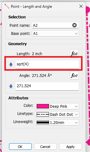
If you know the formula name you can enter the formula directly in a formula field in a dialog… such as in the length here:
Or if you click on the Fx button it opens the formula editor. You can select the Functions checkbox to display the functions list. double clicking on the list item will insert that function at the cursor in the formula box. You will need to add the ()'s around your value.
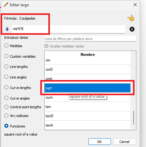
If the formula is not formatted correctly it will display Formula: Error.

Hey… As I was going through the dialogs I couldn’t help but notice that when you use the formula editor it doesn’t put the ()'s in when you click on a function. What do you think of having the dialog add those? It won’t wrap around a value in the formula edit line, but at least it would be less typing, and should be clearer that the () need to be there. I’ll bite my lip, but it should be an easy addition to the dialog. ![]()
UPDATE: Done. I made it add the parentheses and move the cursor between them. ![]()
Thank you very much, @Douglas, it helps if one knows that the brackets are necessary ![]()
After going through the dialogs again that’s what I figured. It’s a minor change, but I think it will also help to enter functions quicker as you won’t have to type the (), and the cursor is between them ready to type a number or insert some other variable. As usual I’m also cleaning up a bunch of the edit formula dialog code as I go. ![]()
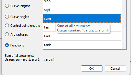
Great stuff, @Douglas. I was just looking at them and I’m wondering if the tool tip at the bottom can’t include an example of how it’s written.
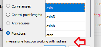
I assue you mean the tooltip here?
That’s a good idea. I could just add a usage template for each function with the tool tip.
BTW… in testing the dialog I’ve decided to add an “undo” to the formula line edit. If you click the wrong function or variable you then have to backspace etc to delete what you added. Much easier to just hit an undo button to restore the original contents.
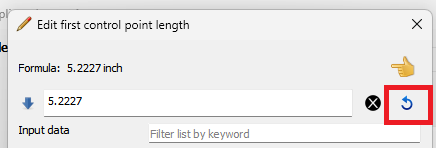
Ok… so I lied. ![]()
Wasn’t as hard as I thought to make it so if there is any text selected in the formula edit box, and you select a function, it will wrap the function and parentheses around the selected text. Woo hoo. ![]()
Only caveat is for those that are use to selecting text, and then selecting a function thinking it’s going to delete the selected text and replace it with the function. I may try and see if I can have it only wrapper the function if say the shift or ctrl key is held when selecting the function, otherwise it would replace the text. Even if that don;t work, it’s a minor difference where I think being able to just select the text and wrap the function around it is more functional than over writing the text. There’s other ways you can delete the selected text - then insert.
Oh… and I did update all the functions with a Usage template in the tooltips. Not that I have used them upto this point, but found out the functions with multiple arguments need to be sepatated by colons (“;”).
Ooh, while you’re messing with the functions, an “Insert” button would be a welcome addition to being able to double click them to insert them.
![]()
There already is… it’s the stupid pointing finger. Maybe I’ll replace it with a better icon. ![]()
Oooh! My mind apparently lumped it in with the useless question mark. & now it’s thinking of how to rearrange the layout & change the icon to make it more clear. Would it be helpful to go ahead with that train of thought, or should I just preemptively derail it for now?
![]()
Wonderful! @Douglas, I knew I could count on you ![]()
Great stuff! I like that.
Haha, once again… You’re a wizard!!! Thank you very much ![]()
I try and get rid of the question mark if it’s still there when I work on a dialog. It’s one of those undocumented things, where you have to implicitly set a dialog window hint flag in the code… there’s no option to show / not show the ? when you create the dialog either by code or the ui form.
Sure… what did you have in mind? Besides the finger icon making no sense, the location of the button doesn’t offer much clue what it does.
I haven’t thought it through, but my initial thought was to displace the filter box, (to under the options?) & put an arrow button of some sort pointing from the option box to the formula box, maybe beside the “hide empty” checkbox.
I also kinda like the idea of the button just saying “Insert”, but that would require adding it to the translation framework…
![]()
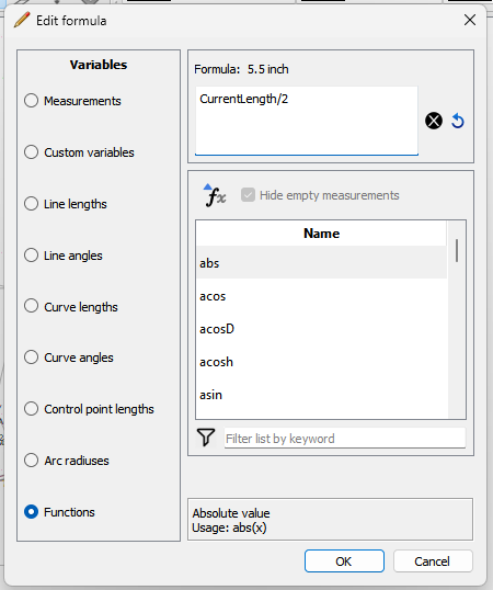
Ok. I reorganized the Fx Dialog which I hope is cleaner and more functional. First off I removed the “expanding” button for the formula edit box… it now auto expands when you click in it. I replaced the “finger” icon with a more suitable “Insert Fx” icon:
![]()
The insert Fx button and the hide checkmark now reside above the table list, and the filter edit box (along with the “filter” icon) are now below the table list.
The radio button layout box is now titled “Variables” instead “Input data”. Yes I know this changes the translations, but “input data” in any language is IMO confusing.
The tooltip display (which mirrors the rollover tooltip) is displayed below that. The function tooltips now display a usage template.
The screencap below is shown at the minimum width, and the dialog is resizable with the widgets that need to be are expandable. It still maintains the current feature of saving the dialog size so you can set a size you like.
I just need to tweak the display of the table list scroll bar… not sure why it’s just displaying a line and no arrows?
![]() [quote=“Douglas, post:4, topic:7644”]
Done. I made it add the parentheses and move the cursor between them
[/quote]
[quote=“Douglas, post:4, topic:7644”]
Done. I made it add the parentheses and move the cursor between them
[/quote]
@Douglas – YOU ROCK!!!
Oy vey… that’s why I hate updating software. Apparently Windows 11 - which I recently updated to - now has settings for the scrollbars including animations. The scrollbar will hide until you hover over it… it will fade in… and fade out when you move off the scrollbar. Unless you turn on the scrollbar, and turn off the animation.
Great stuff, @Douglas ![]()
Bleh! If I get around to upgrading, I’ll apply to you as to where I’ll need to turn off the animation. I’m sure the fade in & out will take an age ![]()
I think that really ups the clarity!
However. 1) I like the formula line to be a line as much as possible, so it would be nice for it to go clear across the top. I think there is still room for the Variables radio list under it. 2) If not, moving the Variables to the right of the dialog would keep them from being over-emphasized, though I admit it would not align with the ‘tabs on left’ standard. Speaking of tabs, would it be reasonable to change the radio buttons to tabs? I feel like that’s what their function is.
![]()