Hi, When I open File > Preferences is it possible to save updates to preferences. The buttons at the bottom of the form are not visible and cannot be reached. Thanks David
Hi, David. You can try pressing the Tab key until you think you’re on the OK button and press enter, or you could try dragging the white bar at the top until you can see the OK, etc. buttons.

Once you’re out of that screen, press this button once or twice to get onto full screen:

That should set Seamly2D to till the screen and make sure that all the dialogue windows fit within the screen.
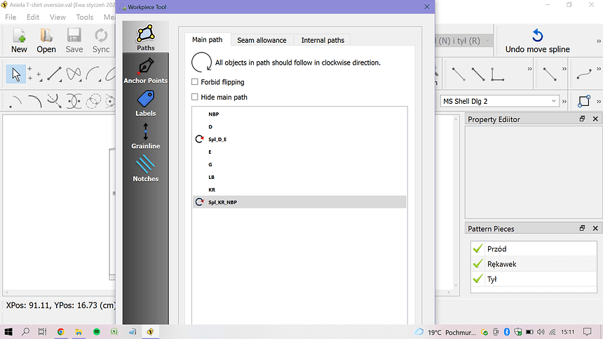
Hi! It seems like I am having the same problem as David had, but the provided solutions do not work. When I open any window (settings, piece details etc.), the buttons at the bottom are hidden (covered). I know that they are there, because if I drag the whole window up, they are visible. As soon as I let the window go, it goes back to the previous position though. I did not find any similar problem, that is why I am reviving this topic.
It seems odd that the UI in Seamly would be so much more massive than the System UI. If you would post the release date of your copy of Seamly2D, (Help menu, –> About Seamly2D,) that would help narrow down what the issue might be. Also which version of Windows you are using could have some effect.

Hello & welcome to the Seamly2D forum, @EwaJ
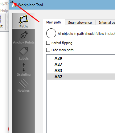
Try to hover your cursor over one of the top corners, click & hold the corner while dragging downwards to make the popup screen smaller:

Once it’s smaller, it should centre on the screen so that you can see the buttons at the bottom. If it doesn’t, then you can click on the blue tab & drag the popup upwards.
Please let me know if this works for you. If it doesn’t, please let me know which operating system you’re working on and the version of Seamly.
Thank you
@Grace @Pneumarian thank you for your help!
Hovering the cursor over the top corner and dragging solved my “issue”  Such a simple solution, I think I had a brain fog and just needed someone to point it to me
  I tried it on multiple different windows and it worked on all of them. It takes some skill to position the cursor well, but it is doable:)
Just for the formalities, I use Windows 10 and recently installed the latest updates of Seamly2D (January 2022). The “issue” was present before installing the updates. Plus, I have a rather small screen that I work on (14’’), I do not know if that is relevant.
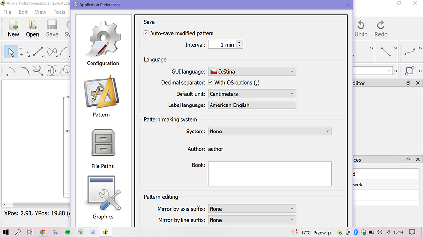
@Grace Ok, I got too happy, too quickly. I found two windows that cannot be downsized in the way that you instructed me - the application preferences and the layout window. Do you have any idea why is it like that?
Hmmmm… I see what you mean. They don’t get the little arrows for me neither. On mine, the popup window fits within the screen, so I don’t have the same problem.
Time to call in the big guns - Can you help, @Douglas?
In the meantime, @EwaJ, if you use your tab key to move from one section to the next, it will eventually land on the OK button where you can press Enter to accept the changes. It should be the next one after the last blue highlighted option.
Because the screen resolution is smaller than the height of the dialogs… and the application’s main window apparently is not in a scrollable area. If it was scrollable you would simply be able to scroll the main window exposing the dialog buttons.
@Grace @Douglas thank you both for looking into this matter!
So I guess it leaves me with using tab key to reach the right button for now.
I am glad that we solved the piece details window though, it was the most frustrating one  Many thanks!
hmm, I see that the dimensions of your picture are 1920*1080, which, assuming that’s the dimensions of your monitor, is the same as my monitor, so that shouldn’t be an issue, unless you have your UI set to a larger scale. In Ubuntu Linux, when I set my scale to 200% (for Science!) I had the same issue, (but worse)
& I see it took me too long to get this posted, but I think it does still add a little, so I’ll post anyway.

I’m sure I can come up with something. ![]()
Just have to figure out one of several ways to adapt the dialogs to the lower screen res… which generally means placing something in a scrollable area which will display scroll bars when needed OR reducing the height of the dialogs - which is kinda of a step backwards OR adding a grab resize to the dialogs in question - which I’m not keen on, as then we will get more issues of “why are the dialogs are not displaying properly?” when users are able to size the dialogs OR I could add code in the dialog .cpp to adaptively resize the dilalogs based on the screen size, but that sort of defeats the purpose of creating UI forms in Creator independently of the code.
Can’t recall, and I’m not at the laptop to check… there maybe keyboard shortcuts for the dialog buttons. That being said… no need to tab… the default button for most dialogs is OK - so you just need to press return / enter. To cancel you just close the window. If there’s a 3rd option like Apply - then you would need to tab.
Very good point, @Pneumarian. My screen setting are set to 1366x768:

And I’m also on Windows 10 & on a Lenovo notebook - nothing fancy.
That could be it. At least on my laptop it appears that the Windows settings limit the scale factor depending on the screen res selected… I tried a few different screen resolutions and scales and they all kept the full dialogs on screen. The only setting that caused the issue was 800x600… which stands to reason as the the dialog is like 620 in height.
Science… Yeah, science is dictating that 3’s look like 8’s on screen. Lol
Hmmm… now that I’m home and at the laptop - discovered something strange. In updating the prefs dialogs I must have changed something in the dialog form (or something else) at some point. Previously the dialogs in question open up at the highest res, regardless of the screen display resolution and scale settings. Picture an 800x600 screen with a dialog at 1920x1080. Hmmm. In current versions the dialogs scale with the resolution and scale - as you would expect, and thus the buttons are off the screen.
It would seem the logical solution would be to have those dialogs scale - that is LARGER text  - as well as displaying scroll bars if neccessary. Kinda of pointless if you select 125-200% scale if you still can’t read those hi-res dialogs.
I’ll figure something out.


