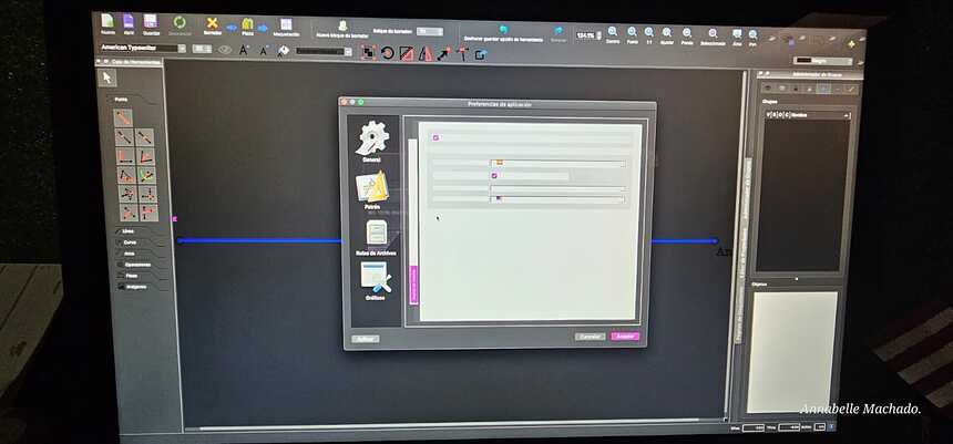
i need help, que pasa aqui?
It appears that you have your system set to inverted colors. However, the preference category icons y the background of the tab area are not inverting with everything else. Such as the text. White on light grey does not show well.
It appears you are using a Mac. To capture a screenshot press command-shift-3. That way reflections off your monitor won’t interfere with the subject.
Espero que este ayudarles.
![]()
AKA… Dark mode - which Seamly doesn’t quite support yet. To properly do that we need to create a whole set of dark mode icons… as a lot of the “light mode” icons will just not show up very well. Big thing is inverting black and white.
That being said… I can see that the issue here is in the Prefs… not sure exactly which TAB because I can’t see, but it may be due to the form using some style sheets or palette that is overriding the (background?) colors. I can check.
it’s the tab with the language selections, I recognise the flags.
![]()
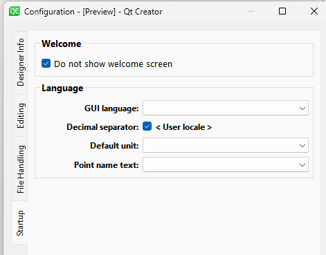
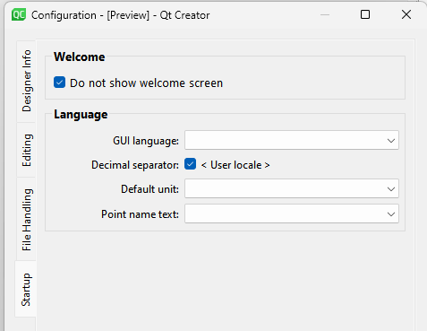
I took a look and indeed I changed the background color in the preference tabwidgets. I think the issue might be that the MacOs tends to treat the stylesheet in a stricter way, where Window is rather lax. I think Windows doesn’t seem to care if you just change the background color for the widget via a stylesheet… where the Mac wants every color defined in the style sheet. At least that’s my theory. I could delete the stylesheet - which is probably what I’ll do, but IMO the white frame on white frame on white frame is harder to read.

where by setting the background with a stylesheet you can at least get this:

This when I wish I had a Mac that I could get instant feedback as I make changes. ![]()
