Hi all. I am just wondering what is the best way to layout the pattern pieces in the layout mode. I always have large empty spaces between each pattern part and it always take me very long time to find the best layout. I feel like I can’t handle my own placement so if anyone has some ideas? Thanks
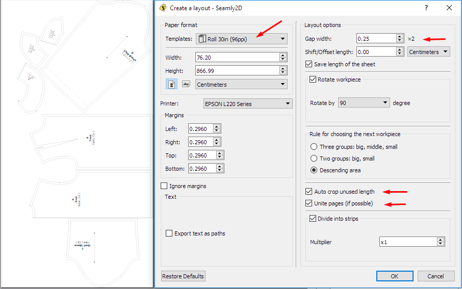
Here’s a pic of the settings that I use. Normally I’d play around with the roll paper sizes and rotations until I get something that’s pleasing to me. I always check the Auto Crop and Unite pages, since I’m printing onto A4 paper and gluing the pages together.
Perhaps a few other people can share their favourite settings with us, too 
You might need to use a wider layout size. It’s the same sort of idea when laying out pattern pieces to cut… generally the wider the fabric, the less fabric it takes overall. If you select a layout size that’s too narrow, you may only get 1 pattern pieces to fit across the width, so the program places pieces on another layout sheet - thus wasting space.Maybe play around with not allowing certain (larger?) pieces to rotate may help to save space.
If you’re printing a tiled PDF you have to think in terms of multiple sizes of the printer paper… like if using 8.5"x11" you might use a layout size of 34"x44" (minus the margin overlap - could be like 33.25 x 43.25 depending on printer margin size)… a 4x4 matrix/16 sheets of 8.5x11.
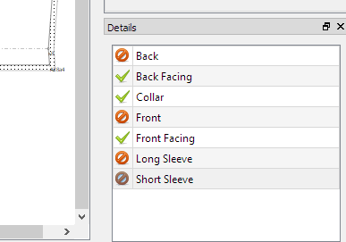
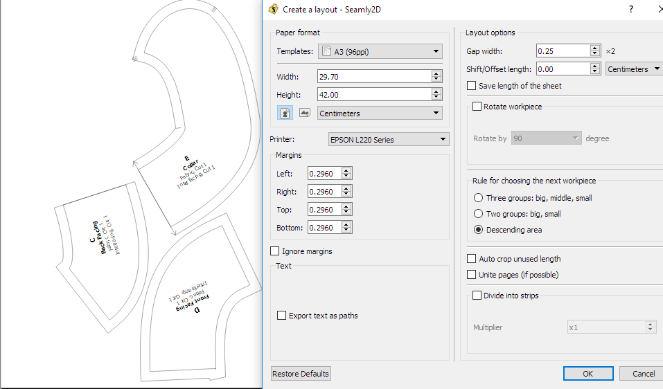
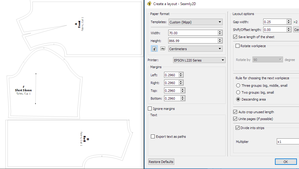
Yes, you can also switch off the big pieces & create a pdf of all the small pieces and then switch off the small pieces & create a pdf of only the big pieces:

When printing a pattern that I intend to tape together, I usually ignore the layout except to see that all of the pieces are there. I then use the “preview tiled pdf” as opposed to “print tiled pdf” and print only those pages that have content. This is not necessarily the best way, just that way that works best for me.
Thanks. I think this could be a good option!


