Improved groups tool

Hey all… I just finished up improving the groups tool and just giving an overview before pushing the updates.

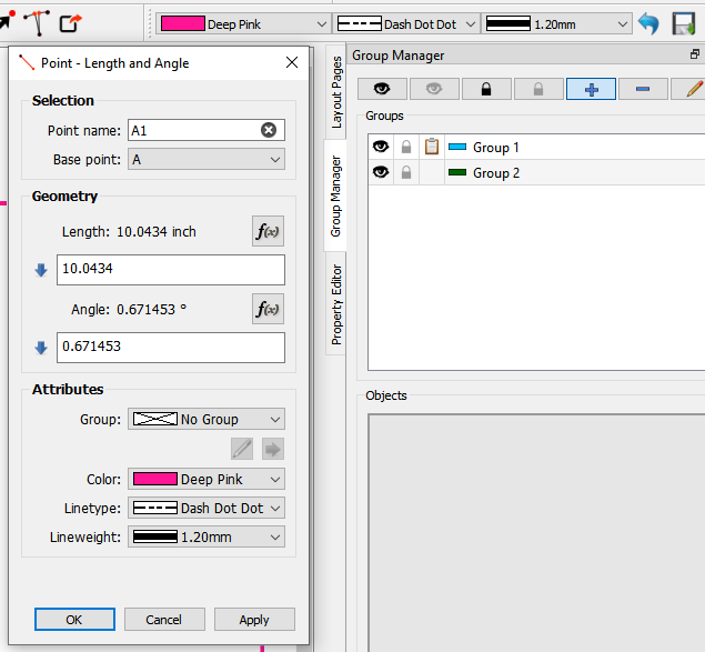
The big difference in the groups is the change in workflow, where now you can create new groups, each with it’s own color, line type and line weight (which will be used in a second round of improvements to the tool dialogs and tools)… BEFORE adding any objects to them.
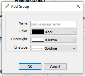
add_group

Groups can be added in the expanded Group Manager. From the row of group tool buttons you can Add, Delete or Edit a group. Besides the usual show / hide, you can also lock / unlock a group from editing, add or removing objects. The Groups table will now display whether it’s visible, locked, contains objects, and the group color (the default is black).
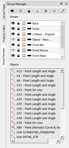
GroupDock

Below the Groups table is a new Objects list, which will display a list of the objects in the selected group. Double clicking on an object will Zoom to that object. Specifically - if it’s a point it will zoom to the point. If it’s an Arc / ElArc it will zoom to the center point. If it’s a line or curve it will zoom to the first point - usually the first point in the object name. Also if the object is hidden, the group’s visibility will be changed to show - even if it’s locked - so that the object is visible when zoomed to. The only exception to this (at this time) is with the operation tools such as move, rotate, mirror & dart. This is due to the nature that a tool id can have multiple object id’s and I haven’t quite figured out how to get the object id’s as they don’t show up in the ‘selected’ item - just the tool id

So… using the context menu on the Objects list allows you to remove or “move” an object to another group.
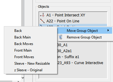
items_context

Objects can be added to a group in one of 2 ways… the old way, by selecting the Group tool, then selecting the objects either one by one or rubber banding. Pressing enter pops up a new dialog to select which group to add the objects to. Groups are no longer created after selecting a group of objects - it was kinda of wonky trying to make the existing dialog create a new group or adding to an existing group. Now you just select from a drop down the group to add to.
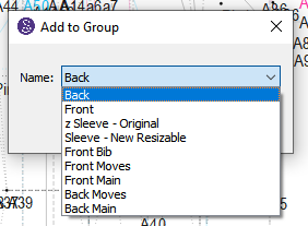
addto_dialog

The second way to add or remove a single object is with the context menu.
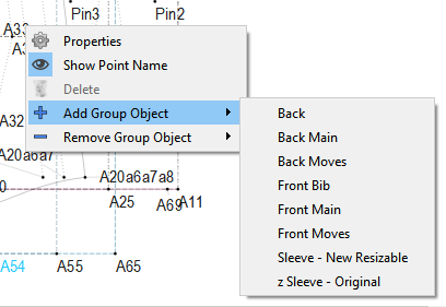
object_context

The other notable change is making the docks vertical tabbing, as well as making all the docks enabled across the 3 modes. This makes better use of the dock space an eliminates a lot of scrolling and resizing to view the dock contents. In other words you can now - more or less - see the whole Property Editor, Group Manager, or Layout contents the full height of the dock. The Groups and Object content is in a splitter that is saved to the settings whenever you resize them. The vertical tabbing will also allow to add future widgets to the dock.
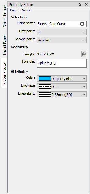
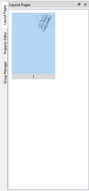
propsdock layoutdock

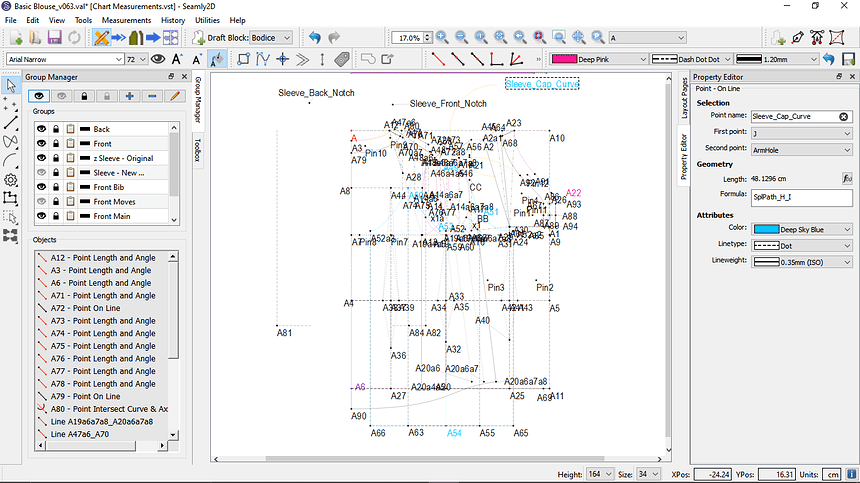
Also for what it’s worth here’s an example of a completety different workspace by moving the dock widgets around.

Future Group improvements will revolve around being able to add a new tool a given group, as well as selecting to use the group color, linetype, or line weight. This greatly speeds up the workflow as you can add a tool to a group as you create it rather than having to painfully add a group & tools as it currently exists.
6 Likes

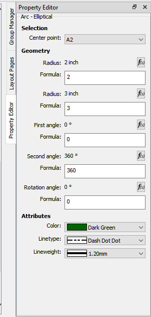
Better example of the Property Editor needing more vertical space… the ElArc is probably the worst case.

elArc

Oh… I should note that while this feature will be in the Dialog and Prop Editor improvement PR before the groups improvements… clicking in a formula field automatically expands the field without having to click the “grow” button… and it automatically shrinks when it looses focus. I’ll probably carry that over into round 2 of the Dialog improvements.

4 Likes

This is so awesome, Thanks @Douglas !!!

2 Likes

Ok… next round of inprovements to the Groups will be the inclusion of a group attribute to the tool dialogs that will allow a user to select which group to place the new tool in. The default is “No Group”… with the pen style being the attribyes of the current pen - as displayed in the Pen toolbar.

nogroup

I figured in the case where the group was changed from a group to No Group, the pen reverts back to the current pen. May revist this bahavior as I test more.

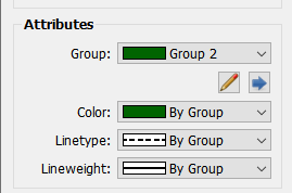
In the case where a user selects a group, the pen attributes will be set to “By Group”. Also the Edit Group and Set to Group tool buttons become active. The Set to Group icon will probably change - just needed a placeholder.

bygroup

The Set to Group button will set all the attributes to the current Group in the event any of them have been overridden. Which is what I may need to revist… we may want to preserve overridden settings if we switch groups, and not have them all set to By Group with the new group pen.

3 Likes

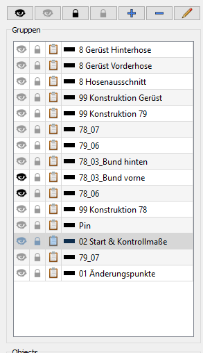
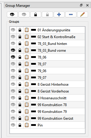
Nach dem Update, habe ich festgestellt, dass die Reihenfolge der Anordnung von Gruppen total durcheinander gewürfelt wurde. Ich habe durch das Voranstellen von Zahlen immer eine Reihenfolge gehabt. Die würde ich auch gerne beibehalten:

image

01 / 02 war oben, dann kamen die Zahlen in aufsteigender Reihenfolge und unten die Gruppen ohne Zahlen. So war ich sicher, dass die Gruppen, die am meisten gebraucht werden auch oben standen. Jetzt ist alles durcheinander. Gibt es eine Möglichkeit die Gruppen in der Liste zu verschieben?

2 Likes

Nach dem Update kann ich diesen Punkt auch leider nicht mehr ändern. Es ist die Hüftweite einer Hose. 2023_004_Stephan, Karin_Hose Malte_v066_(3).val (143,2 KB)

1 Like

Hi @Scholli

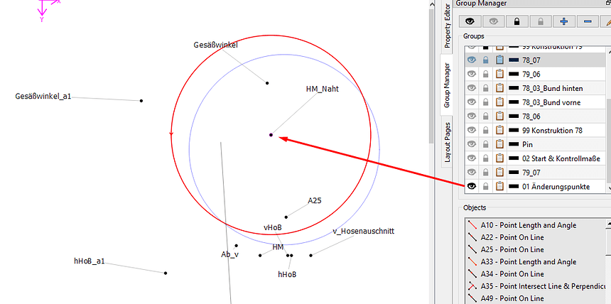
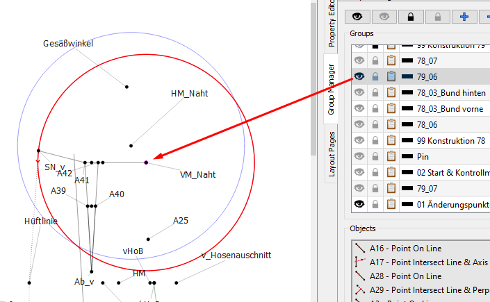
The middle point in the one circle is in group 01 Änderungspunkte:

And the other one is in group Pin:

image

I understand the problem with the ordering of the groups. It throws one completely out if it’s not in the order that you prefer. Perhaps @Douglas will have a look and find a solution for us :upside_down_face:

I didn’t get the same problem with the node as you did, but then I don’t know what size you are working with.

1 Like

Well, that’s interesting. Up until last week I was always building using the GCC compiler, while the Github releases arte based on MSVC. My builds are sorting the name column just fine - even though the code is not specifically calling for a sort on that col.

groups

What I found looking at the code was an oversight on my part, in that after adding the Lock and Has objects columns, I never changed the col variable in the line that is suppose to sort the name column. DOH. Since I was always testing my builds I never noticed the release versions don’t sort the name.

So. It’s an easy fix.

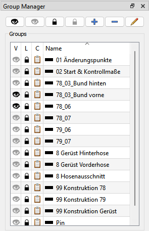
Question is how does anypne feel if I add the header row to the Groups table so that you can click in the header to sort by any of the columns - with the default being sorting on the name col? It would be like the Pattern Pieces table in Piece mode.

4 Likes

I can easily fix the sort by Name issue no prolem as pointed out above,

What I can’t fix is odd behaviours when an object is included in more than 1 group. That’s why in a previous discussion I tried to make the point I don’t think having objs in more than 1 group is a good idea. The appropriate fix would be able to have subgroups, but that would require a complete rewrite of Grouping, as well as resolving what to do with existing patterns - which I didn’t want to do at this time.

2 Likes

Thank you very much for fixing the orders. I think it would be nice feature to reorder by the header columns, but I don’t think I’d really use it because I’ve also become used to naming my groups so that they remain in an order that I want.

I understand, but I’ll really cry if you took this feature away and I think @Scholli will, too. Sometimes, patterns get so very busy and bits overlap the front & back, so putting the most important objects in a group on their own helps to keep the main parts of a final design in a group so that you can switch off the things that went before and only view it before creating the piece.

Actually, this is exactly the problem that @Scholli has above, where she didn’t include the centre nodes of the arcs in the group that she’s working in, so she couldn’t access them without opening the groups that they’re. But opening those groups add so many more objects to the drafting board, that it becomes very busy.

2 Likes

I went and added the header to the Groups… just need to get the first 3 columns to sort correctly. In any case - the table will initialize wirh the table sorted by name - so if you don’t click the header nothing would be different.

sort

Not going to happen anytime soon, if at all. My first rule of thumb is don’t break existing patterns. :slight_smile:

3 Likes

Thank you very much, @Douglas. You’re a :star2: :star2: :star2:

Yeah, if it ain’t broke, don’t fix. :star_struck:

This means that within a week or two it should be possible to sort by Name (default), visibility, object color, or whether the group is locked, right? Will it be possible to toggle sort direction? I assume some people would find that helpful.

On the one hand, I’m jealous of my space, but on the other hand I do think that the service this will be to many users is totally worth the loss of one screen line.

:unicorn:

3 Likes

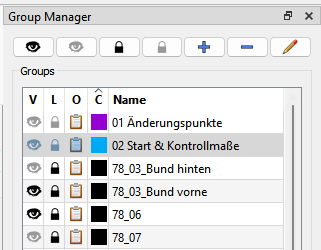
Sort by visibility, is locked, contains objects, or name. The color at this point only shows as the icon of the name cell so it not sortable. I could add another column and make the color sort like in the Pattern Pieces table. Which actually required a custom TableWidgetItem class, as tables only sort by string or number and not by icon. It was a tricky thing to figure out. I can just use the same code in the Groups.

For lack of a better descriptor, I think I’ll change the objects header column to “O”, and use “C” for the color. BTW… for now the group colors are limited to line colors… in the future I can change that to any color and have the color palette open with a doubke cell click like in the Pieces table.

3 Likes

Meiner Meinung nach ist es aber wichtig einzelne Punkte unterschiedlichen Gruppen zuzuordnen. z.B. Punkt ist das Ende der Vorderhose und der Anfang des Bundes, mit dem ich die Bundhöhe bestimmen kann. Wenn ich diesen Punkt noch in die Gruppe mit meinen angelegten Änderungspunkte legen möchte ist er in drei Gruppen vertreten: Vorderhose, Bund und Änderungspunkte.

2 Likes

Ok… I moved the color icon to a separate column, which will allow sorting by color as well.

newgroups

3 Likes

Das ist so aber noch nicht frei geschaltet, oder?

1 Like

No. Working on it. If all goes well, would expect it to make it in next Monday’s release.

2 Likes

Subgroups would create an order, which establishes which rules (visibility, color, …) apply, kind of like how CSS styles are applied, is this correct @Douglas ?

1 Like

It would be like parent- child relationships, where the child behaves like the parent. For ex you have parent A, and children 1, 2, and 3. You could toggle the visibility of any of 1, 2, or 3 - let’s s say 1 = hidden, 2 = hidden, 3 = visible… but only if A = visible. If A is hidden, so are all the children. Then it’s a matter of how many levels deep you want to go.

The issue I have is putting objects in more than 1 group… for ex: If you want to set an object to the group color, but it’s in 2 groups - what color does it use? Can’t be both, and that’s a dilemma I’m up against at the moment.

3 Likes