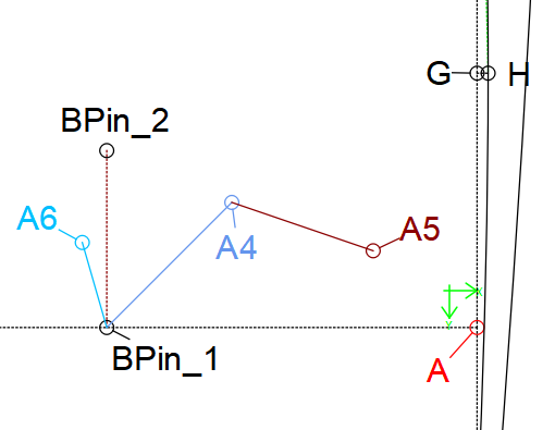
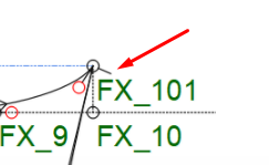
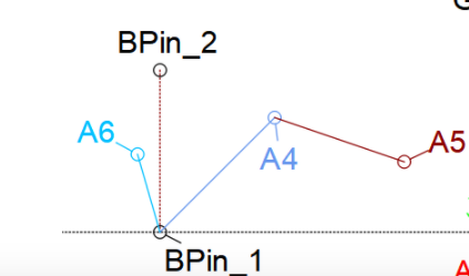
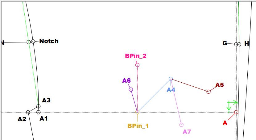
Issue #122 - Improve point label - size/color/hide features

I made a lot of headway with the point name text display. First I’ll show you what I’ve done so far, and then ask for input regarding how to proceed with the color options.

So now there will be several ways to show / hide the point name text, as well adjust the text size.

  1. There is now a submenu item in the view menu for Point Names and there are 3 items to select from: Show text, Increase Size, and Decrease Size. I used the F1 as shortcut for the text visibility - to go along with the show / hide Curve Details F2. I chose to use the standard Office Word / Libre Office shortcuts of Ctrl + [ and Ctrl+] to change the font size.

shownames

  1. To show / hide an individual point name there is now a Right Mouse context menu item to set the visibility.
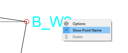
context

  1. There is now a Point Name Toolbar… with a show/ hide tool button. The toolbar also provides an increase and decrease font size tool button, as well as providing drop downs (combo boxes) to select the font family, and point size.

text_toolbar

The toolbar can be hidden in the normal manner using the context menu on the toolbar area or via the View->Toolbars.
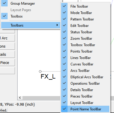
view_toobars

In addressing issue #122 there are 2 ancillary features I added. One is separating the point name font from the label font used in pattern piece labels… which can be found / set in the new Fonts tab in the App Preferences.
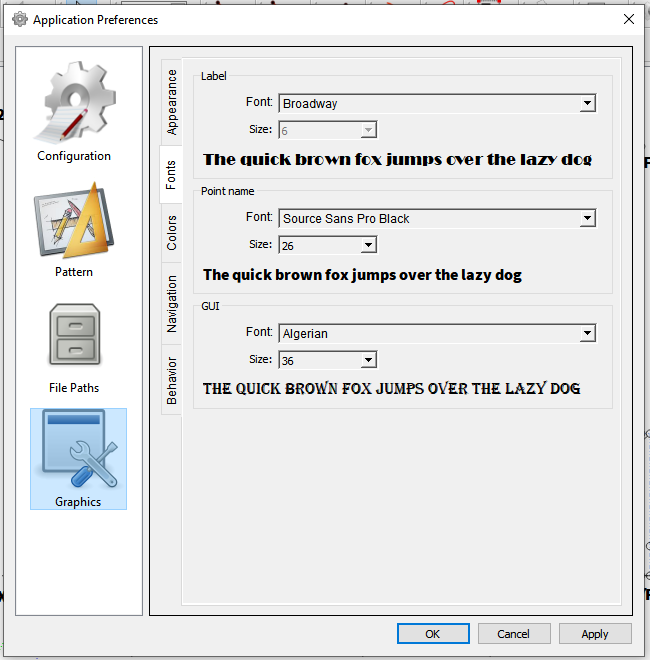
fontprefs

Note: I also added a separate GUI font so you will be able to set the gui font used in various places instead of the current hard coded font. One place I already previously switched the font was the in the Main path node list.
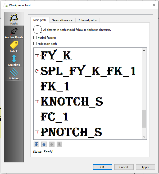
guifont

The other minor addition - since I was already editing the context menu stuff - is in the Object tooltip… It now displays the objects name.
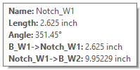
tooltip

So that covers all the point name font, size, and visibility features. Which brings us to the color. Some background first… each point has 3 different parts to it that can be handled any number of ways.

There is the name text, the line that is drawn when the text is moved a given distance from the point, and the point itself. All 3 have their own color attributes… the point and text which also have a hover color. I set some colors just for demo purposes here: The text being cyan, the point being red, the line black, and the hover remains the current hard coded green.
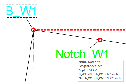
textcolors

One thing I propose to do is to provide the option for a user to set the hover color in the prefs (it might start to become apparent why I added the prefs Colors tab).

The question I then have is how to handle the colors for the normal display. The idea is to make the text the same color as the tool (line)… but do we want to make the point and line the same color as the text? I’m not sure how that would all look?

Here’s what I’m inclined to do:

  • Leave the line black.
  • Leave the point black OR add a user pref to set the point color - keeping in mind the point color can change from black to another (hover?) color depending on the geometry.
  • Create a default color pref (currently the default draws from the textPalette ->brush for the app and is then set to a hard coded black after the 1st hover over?? another RT mystery) for the point name text. Also create an option (in the menu & toolbar) to switch the point names between the default color to the tool color.

Thoughts?
4 Likes

+1

+1


1 Like

Got it. I’ll rearrange the 3 items to take on the point’s tool line color… not surprisingly there’s a minor snag. Not all tools have a line color. For example the curve & arc “cut” tools.

Which is another app oddity I don’t quite understand - you can set a line color for a point along a line, but not along a curve or arc?

Can I assume we would want to have (as a future feature) the same lineColor / lineType properties option with points along curves & arcs?

Also…I’m not quite sure yet if the operation tool points have access to the line color either.

That being said… what I could do for now is set the miscellaneous point name’s color to the “default point name color” ? - which BTW will be black until a user sets the default pref color.

3 Likes

Well… you would think it should be a simple thing to get the color of any given tool - of course not. Different tools have different places to store and access the line color (and line type), while some have no color at all. Line based tools use one way, curves use another, and operation tools have no way.

I’m debating whether to fix this (mess) by placing these attributes in the VDrawTool class - which all the tool classes inherit - so that it gives a common way for ALL tools to store and access the pen style attributes. It will give a way I can pass the color to the classes for any point name in the same fashion, regardless of the tool. It will require some work rearranging some class members and methods, as well as adding a color attribute to some of the tools that don’t have one, but I think it will make sense in the long run.

1 Like

Yes, I’ve often wondered why some tools have lines available while others not & we have to go & draw in the line later, if we want to use those lengths

What I’ more concerned about in the regards to this issue is a tool color, or lack there of. For the most part only those tools that have a line using the attribute “lineColor” or a curve (spline) using the attribute “color” set a color from the tool dialog and save it in the val file. For ex:… if it’s just a point only tool - like the Point from XY tool- there is no linecolor / color, so I have no tool color to pass onto to the point name graphic items.

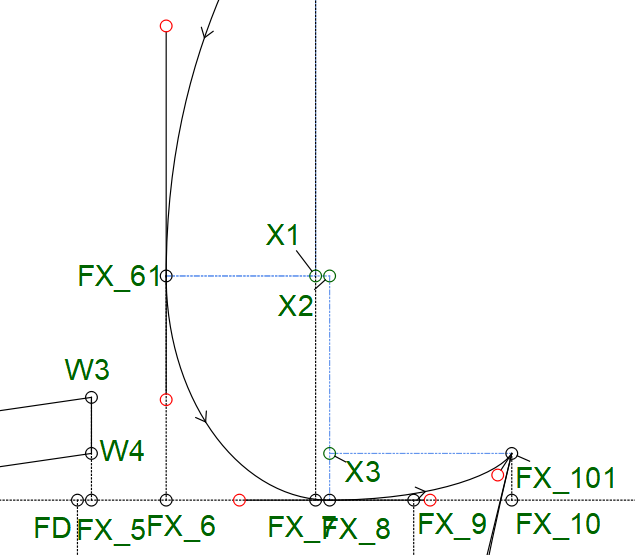
That being said - yes… I agree on your point. In fact I picked the Point from XY as an example because that’s one of those tools where I do exactly like you said… I draw in lines between the points - mainly as a visual context of what a XY point is. I use the Point from XY to establish reference points for sizable control points of curves. Like the points X1, X2, and X3 in the armhole below. Certainly doable to add to the geometry of this tool to draw those lines. This tool is a prefect example of what I was referring to, where by adding to the XML schema & dialog now, it will make it easier to add additional geometry later.

XY

Then there’s the operation type tools. like move, rotate & mirror, where the tool makes a copy of the selected objects, again having no color of their own. I haven’t quite got there yet, but there’s another issue here to consider. You could be selecting a group of objects all with their own tool color… which color to use in the copy? Another reason to be able to set these tools with their own color… which would make it easier to distinguish between it and the parent object(s).

1 Like

Here’s kinda of the idea: Note the draft block’s basepoint A is red… this is hardcoded. Since Red is excluded as a line color and used in special cases, it’s probably best left as is so that one knows that the Red point in any block is the base point.

test

3 Likes

I’m thinking that… If the groups are going to have their colours, and the labels are going to have the colour of the lines… how is this going to all fit together at the end of the day? I’m totally lost & kinda think that we should keep it as simple as possible.

image

And then the line indicating the label… If it’s at all possible, could this line also be the same colour as the label? To show that it belongs to the label, rather than another line?

Yes, I guess it can have the red just for it. :blush:

image

I think that this is perfect. Thank you very much :star_struck: :star_struck: :star_struck: It makes most of the labels and line colours the same, so that one can see where the node is coming from and going to - at a glance - which is why I’d like it :smiley:

Once again, thank you very, very much for all your hard work.

1 Like

In the example I last posted it is. Each of the tool lines, Points, Point name texts, and the indicators (or “leader” in drafting terms) - are all the same color. I just did a screen cap o the armhole in the build I had open - which was only a test of the default color pref, no other colors added yet. It was just to show the blue dashed lines I added… otherwise you just have these points out in the middle of nowhere. :slight_smile:

BTW… I’ve sort of worked out in my head adding the option to toggle the point names (point, leader, and text) between a default color pref and the tool color. In other words you’d have the option to set the default to black say, and switch between black or colored point names. That way we’d only be adding a “color” option, and not forcing users to look at things differently… or as it were, an opt in philosophy.

2 Likes

Yay… finally got it all working. Lot of moving parts to the color aspect.

So here’s the current Point Name toolbar:

pointname_toolbar

You can set the font and pt size here (and in the prefs), increment / decrement the pt size, set the visibilty of the point name text, and an added toolutton to toggle between the default color and the tool (line) color.

In the prefs you can set the Font & size, the default Point Name color, as well as the hover color.

pointname_fontpref

pointname_prefs

If the color tool button is toggled on, then the tool (line) color is used for the point, leader line. and text - with the exception of the base point, which will always be colored red.

pointname_toolcolor

If it’s toggled off, then the default color set in the prefs is used.

pointname_default

And when you hover over a point the hover color set in the prefs is used.

pointname_hover

And of course toggling the visibility toolbutton turns the point names on / off:

pointname_hide

The Point Name tools are also acessible in the View menu:

pointnames_menu

Just need to check and make sure everything is working correctly, and I can push these changes. Since most of the tool dialogs need to be updated, I am choosing to add the tool color attribute to the tools that currently don’t have a line color (such as rotate, move, mirror) when I update the dialogs. Until then they will be black as they are presently.

7 Likes

Oh, wow! I can’t wait to try these :grin:

1 Like

Ich auch - meine absolute Hochachtung - ich kann halt nur Schnitte und Nähen :face_with_hand_over_mouth: image

1 Like

The thing that’s nice with the colored point names is you can identify which point is which when the points get crowded and sitting on top of one another. :slight_smile:

Oh… I should have mentioned that the font, font size, and visibility toolbutton also work in piece mode to show / hide the point names, but toggling the color toolbutton has no effect as the text color is always the default color set in the prefs. Maybe in the future the text could be toggled between the default and a “piece” color? I expect to add being able to color pattern pieces in some fashion - whether by piece or by a fabric selection.

I shoud also note that if the default point name color is set to black and the hover color to green - then it will perform just as it does now.

pointname_piece

5 Likes

In reviewing the feature updates I thought I’d clarify regarding the default color… all of the tools except the rotate, move & mirror will also display the default point name color, even though they don’t set any color in their dialogs. This would include many of the intersection tools that produce a point, but do not display any geometry.

Also I added a few freebies: You will now be able to set the color of,

view_prefs

and hide the Axis Origin point (via the View->Axis Origin item:

view_Menu

or on a View toolbar… along with show Curve Control Points. Note: I renamed Curve Details to Curve Control Points because “Curve details” is a bit ambiguous.

view_toolbar)

6 Likes

Hey folks… sorry I’ve been a bit MIA on getting this issue committed - I’ll spare ya’ll the details.

Anyhow… I finally tracked down an annoying bug and in the process discovered a few more that needed fixing - some of which where previously existing, couple added with my updates. In the process though I was able to unravel a bit more of the structure of the program, which may lead to a another path to adding some other new features in a way I hadn’t thought of before.

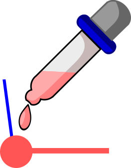
That being said I also made a few changes which I hope will improve the Point Name text even more. For one, I changed the icon for toggling the text color to this:

pen_color@2x

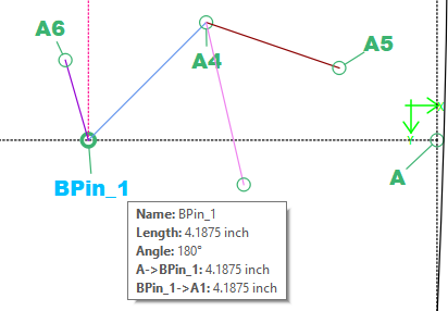
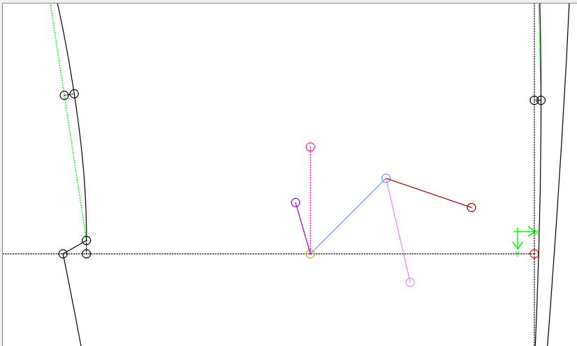
Also to be more consistent with the use in other apps, and within Seamly2D itself, Since Many CAD and vector programs use a square to represent a node / control point VS a (path) point, I changed the Curve Control Points to a square instead of a circle. Which actually simplifyied some code in the process. Also many apps use sizing handles that are also square… so I will be able to reuse the new widget class I added elsewhere (such as with the piece labels) making the use of the gui more consistent.

I also changed the point circles to a solid filled circle, which IMO improves the visibilty even more. If the solid fills proves to cause a performance hit with lots of points, I could add a “Wireframe Mode” that would revert it back to a non fill brush.

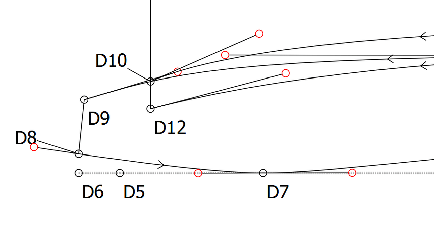
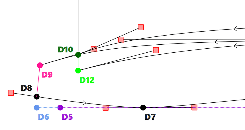
Before and After:

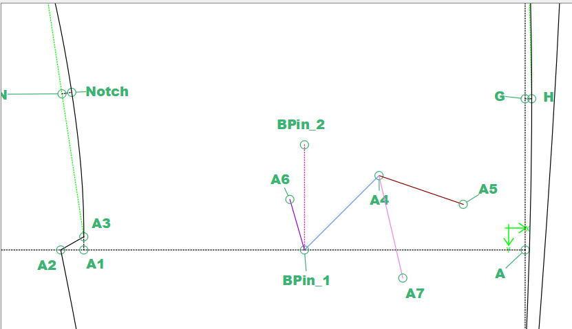
Another change I made was in regards to the distance between the point and text when scaling… currently if you zoom in / out - since the leader line length remains the same, when it scales the text can disappear off the screen. By making the leader line inversely scale as you zoom, the text remains at a (more or less) fixed distance from the point and in view,

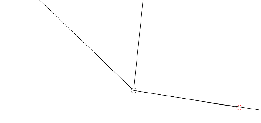
Before and After:… as you can see in the before, Point D8 goes out of view while in the after the text remains at a fixed distance (on screen) from the point - regardless of the zoom scale.

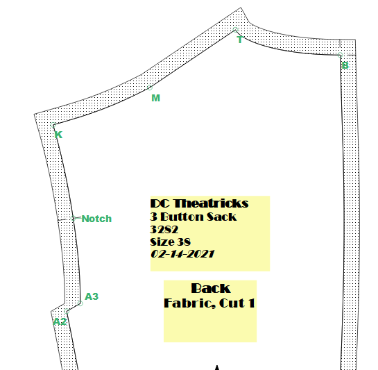
In debugging this issue I was paying more attention to the display of points and I thought of a few additions that might prove useful. That is when it comes to showing / hiding anchor points and internal path points. Currently the anchor points will show when you open up a Work Piece tool label or grainline dialog - the anchor points & text will show… and internal path points don’t show at all.

So the question is… would anyone find it useful to be able to toggle the anchor & internal path points in piece mode, just like the control points in draft mode?

3 Likes

Bei den Internen Pfadpunkte sehe ich nicht unbedingt die Notwendigkeit. Die sind ja auf dem Detail zu sehen. image

1 Like

Isn’t that a more standard icon for selecting a color from elsewhere on the screen?

I foresee this being way less confusing. Yay!

Besides that my psyche is panicking a little, I’m pretty sure I’ll like this better than wireframes once I get used to it.

:partying_face:

I’m not sure I follow, I haven’t made as much use of these features as I ought, but yes, it would be helpful to be able to hide internal paths, rather than just being able to delete them.

1 Like

I agree with @Pneumarian here, that is a color sampling icon. Perhaps a color fill icon would be better since it will fill the circle with color. Something like this:

image

And I’d also like to have this feature :grin: but only when you’re ready to do it. Like @Pneumarian, I also have to delete the internal paths sometimes to have them not visible on the pattern when I don’t want them. But that’s icing on the cake, IMHO

Other than that, I love all the changes you have created and I just can’t wait to try them out :heart_eyes: :heart_eyes: :heart_eyes: :star_struck:

4 Likes

Alternatively, something like this, which is very similar to what you have, except that it’s obviously dropping color (Edit - New Image Added) :

Node Fill

2 Likes

I have a paint can idea I’ll post later tonight.

2 Likes