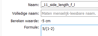
I noticed it is possible to enter a minus number as a measurement in SeamlyMe. Even -0. Now perhaps it would be needed because there are calculations possible that end in a negative?? Even so I can enter a length of -0/-1 (minus zero divided by minus 1), making 0 as result. 5x-1 results correctly in an error, also 5/(1-1), but 5/(1-2) makes -5.
Why is this a bug? Measurements are only variables and don’t have to represent a positive value. Also because a (custom) measurement may be a result of a formula, they have to accept negative values. Also also… you can use measurements conditionally in formulas… if neg do this else do this sort of thing. Also, also, also… func’s have to be able to accept neg measurement values.
I did put in a question mark. It was already my suggestion that negative numbers may be needed.
And dividing by a negative just didn’t make sense in my mind. But hey I just put a question, so thanks for the answer. (I may have more ignorant questions coming…)
Again you have to look at measurements as variables… where in the case of “known measurements” we just happen to be overlaying a template of body measurments. Custom measurements could represent anything. For ex:
Not a problem… questions are good. Due to the “fomulaic” nature, the app(s) often go against what we would consider normal. That being said… maybe there might be a good case to implement some sort of option to force validation of “known measurments” to allow only positive values? After all, last I checked our bodies do exist in the real world of positive numbers
everyone should check the results of their formulas/entries and then double check their measurements before they start drafting patterns with it.
and we shouldn’t assume that the measurement areas will be used in exactly the way that we use them. Someone may actually want a negative number in there somewhere.
Agreed… that’s why I said make it an “option”. And it would only apply to known measurements. The validation would happen as you enter the formula / value. or maybe it could just be changing the calc value text to red, but not affect the behavior.
Please be careful with choosing coloring as a warning system. There are those, me included, that are colorblind. A huge impairment not many people recognise. I will not spot the difference between green colored text next to red colored text for instance.
And yes I do need help figuring out color schemes for my fabrics. Thanks M!
I heavily rely on other visual queues like exclamation marks or triangles. High contrast helps. But please do not change the whole software on my behalf. I am used to software not being adapted to my visual needs. Still, since about 8% of males have this congenital red–green color blindness, it is strange there is not more software adapted.
Yes, perhaps we should just leave it as it is. As you saw, it gives an error is you do something that it doesn’t recognise and it does give a minus sign if the value is negative.
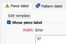
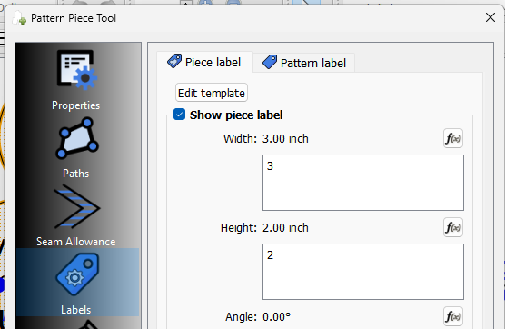
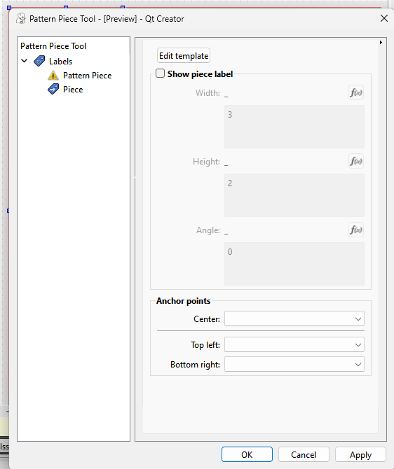
Point taken. Instead of color coding measurments (red?), I could display a warning triangle icon instead? Such as I did with the Label tabs in the Piece tool dialog…
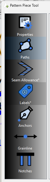
Well since the app displays fx errors by changng the text to red, maybe I can look at again displaying the warning triangle instead. BTW… just as a side note - actually for anyone, since when using the Pattern Piece Tool dialog you could have errors on multiple tabs, an * is placed at the end of the Tab item name to indicate that Tab has an error that needs fixing before you can save. The Seam Allowance and Labels pages have errors.
I like that idea and perhaps the same triangle instead of the * at the items that have errors? I just feel that something needs to be done to show an error… basically it must be ‘In Your Face’ and any help text must be the same. Too often these aren’t noticed until it’s pointed out to a person.
Can’t work that way. The side menu in the Pattern Piece Tool dialog is a list widget, and each menu item is a text, and like all widget texts you can have 1 icon associated with the text string. In this case the text is underneath the icon. That’s why the * is used (not my doing). Without subclassing the list widget, or creating some other widget, can’t use 2 icons with the text.
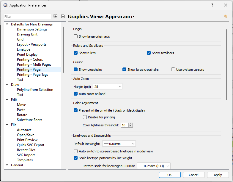
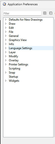
That also starts to present layout issues as well… larger font means “wider” list widget, and it will take up more vertical space, meaning then you’re looking at the scrollbars popping up. Personally I hate scollbars. I think there are some better optons… especially since we’re probably going to need some more menu items as more features are added to the Pattern Piece tool. Could look at a tree widget, or just make it a true Tab widget, in either case we could just use the warning icon like I did with the Label tabs BTW… I would also make the Preference dialogs using the same structure. Personally I’m kinda of leaning towards the Tree widget as it provides for easy expansion, and allows multiple levels of access. For ex… here’s the App Prefs in QCad opened up:
or you can choose to collapse any or all root items:
By going with a tree we can also simpplify and eliminate the Tab widgets with a page… for exmaple the Labels. Imstead of this:
We would have a Tree item [icon]“Labels”, with 2 sub items [icon]“Piece label” and [icon]Pattern label. something like:
So assuming you have the main tree items expanded you can get to a pattern label page with 1 click, rather than the 2 it takes now. I would think that if there are errors, we´d want to show the warnng icon on the main item as well as what ever sub items have the error. That way if the main item is collapsed you can still see at a glance where the errors are.
I love big friendly icons, but considering the number of sub-tabs we have, I think the tree is friendlier, especially in light of how many times I have to switch between different categories sub-tabs while trying to figure out what I’m doing.
I also like the idea of a tree. Not only will it be easier to access the items & allow for future expansion, it also kinda slots in with the tools in Draft Mode. Keeps everything in a similar format
It’s just easier to maintain the dialogs all around. Like I stated I can remove the Tab widgets, and another level of layouts in the form. The layouts are needed to make the widgets adjust in size… and with a dialog like the Piece tool, there are layouts nested in layouts nested in layouts.
I think the tree model is just more efficient. Especially when you start getting to the size of the preferences. Which is why I used the QCad prefs as an example.
I have dabbled a bit with coding for my own purposes. and found that a greater difference in contrast between background and warning icon helps. Likewise not placing similar ‘grey values’ to far away from each other. A green and a red in larger graduation helps a bit, but I can not guarantee I can see an icon as being red or green, the flag on the icon (eg an exclamation mark) is also a major factor. ‘Flattening’ the number of color choices helps. (try to avoid 256x256x256 colors, limit them to perhaps 8 or 10. Perhaps a yellow triangle with an exclamation mark. Tritanomaly (blue-yellow colorblindness) is pretty rare.
I’m not saying you should do all of that that, merely sharing some of my experience. Grateful you are willing to look into that at all. Not very many software (nor their coders) are doing that.