Optimizing Seamly2d for keyboard use: tab key order and OK / Cancel shortcuts

First of all, thanks for creating this open-source piece of software for the sewing world. I think this is a superb addition to the sewing world and, really, the world at large!

While working with this program, I’ve noticed a couple of instances where the workflow forced me to move from my keyboard back to my mouse again more than was pleasant for me. A big one is the behaviour of the tab key: in many dialogs, the order of fields and buttons selected is seemingly random.

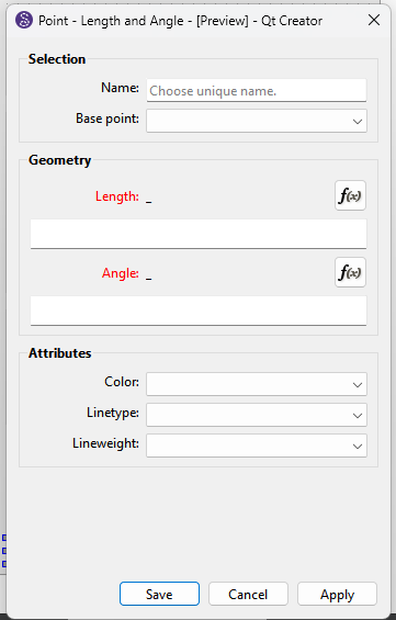
The dialog for the “Point — Length and Angle” tool, for instance, starts with the Formula Wizard button selected for the length. (For me, the Name field would make more sense to be focused first, by the way.) If you then press tab, you would expect the next field to be selected, in this case the field to manually type in the line length.

Instead, though, the OK button is selected. Another tab press does select the line length field, then the angle field, then selection jumps up to the “Base point” field, then up again to the Name field, the Fx button for the angle…

This feels quite random, and unpredictable. Which slows down keyboard users, as they now have to move to the mouse to select the field they want to adjust or button they want to press.

Perhaps this is a platform thing—I’m running Arch Linux, with the latest version of Seamly2d on the AUR. I run Seamly2d preceded by “env QT_QPA_PLATFORM=xcb” to solve some Wayland issues.

Another thing that could really help keyboard workflow is more underlined letter shortcuts. I think these are called “keyboard mnemonics”. At the moment, only File, Tools and Help have an underlined letter to indicate their shortcut of alt+that letter. I assume this is to prevent overlapping with other keyboard shortcuts, but it feels a bit restrictive.

Many dialogs would also benefit from underlined-letter-shortcuts for the most-used buttons. Especially OK, Apply and Cancel. Maybe Cancel isn’t necessary, as the Esc key does the same thing… But then Esc doesn’t work in all dialogs. The Formula Wizard, for instance, doesn’t cancel when I press Esc.

I hope this is helpful! I wouldn’t want to be bothersome with this, and I hope it won’t be interpreted that way.

Qt does not provide shortcuts for buttonbox QPushButtons created in a UI form in Creator. The text’s all have to be overriden with custom text… read that as ‘lots more redundant code’.

"Underline access keys (mnemonics) generally do not work well or maintain consistency when an app is translated into multiple languages. "

The Core Problems

  • Letter Availability: A key letter chosen for an English menu item (like “S” in Save) might not exist or might appear only at an awkward position in the translated word (e.g., in another language).
  • Duplicate Keys: Translators working independently on different strings often accidentally assign the exact same letter key to multiple items within the same menu.
  • Special Characters: Translated words in non-Latin scripts or languages heavily utilizing diacritics break single-letter shortcuts because they require multi-key or dead-key inputs.
  • Maintenance Burden: Every time copy changes or a new language is added, developers or localization teams have to manually audit and re-assign unique keys.

Better Alternatives

  • Rely on Standard Accelerators: Use universal keyboard shortcuts (like Ctrl+S or Ctrl+C) for frequent commands because they do not change based on localized UI text.
  • Contextual Arrow Navigation: Allow standard arrow-key navigation once a menu is open, which satisfies keyboard users without needing hardcoded letter underlines

That said when I first started working on Seamly I was adding the underline accelerators… until I got into translating the text sources and found out what a headache it is.

Ah… Right. I can see how internationalization in combination with this could be a pain, yes.

I suppose in this age of AI, this could be done semi-efficiently by having it look at precedents set by other translated software, to hopefully get to some universal underlined letter logic. But of course, using AI in the first place is a whole 'nother can of beans.

I have to say I’m not crazy about using the arrow keys as an alternative, but I’ll make do :sweat_smile:

Would it be possible to have the Esc key work for Cancel in the Formula wizard, at least? That seems to be an exception to the precedent set in most(?) other dialogs. I’d love a keyboard shortcut for Apply, but if that leads to redundant code it’s probably better to let that go, yes.


What about the tab key order? Is that something that could be done? I’m very used to using tab to navigate dialogs everywhere, and it’s just a bit of a jarring experience in Seamly2d at the moment :see_no_evil_monkey:

That’s just what Google spit out. :roll_eyes:

The “modal” tool dialogs are all based on the dialogtool that is handling the accept(), apply() and reeject() signals.

The History, Variables table, and Fx Editor handle those signals differently. I can certainly look at adding the Esc key to trigger the reject() signal.

That can be changed,. but keep in mind there are users that have been using the app for 13 years and are used to the length fx button being the 1st tab position as you can simply hit the Spacebar to open the formula… vs having to press Tab… Space to focus the length tect box as the 2nd tab position.

In an ideal world there would be a “User Tab Editor” where users could customize the tab positions for each dialog. Given 50+ tool dialogs alone that’s a huge undertaking to implement.

If there are any tabs that really make no sense I can certtainly change those.

I suspected as much, but I figured I ought to reply anyway :sweat_smile:

Thanks, that would be great! Just a little bit of added UI ergonomics :innocent:

That reminds me of this famous xkcd comic: xkcd: Workflow

Still… Yes, I can see how those specific users would be negatively impacted, but I would really expect most users to expect the tab key order to move left to right, top to bottom, as that’s how it is in pretty much all software. UI predictability is important for accessibility, too—see here: How-to: Use the tabindex attribute - The A11Y Project

The initial field focus on the Fx button could still be retained, by the way, right? That makes sense, it’s probably a more useful field to focus first than the name field.

Well… Okay, quite honestly: most of them currently don’t really follow the left-to-right, top-to-bottom order. And, to me at least, don’t make much sense. I’m still in the spline Properties window, from my recent bug report. There the order starts off reasonable:

  1. Name
  2. Point
  3. Path

But then it skips “Color” and jumps to Linetype and Lineweight, and then jumps back up to Color.


A more regularly used tool, Point Length and Angle, starts at the Fx button, as mentioned, but then the order goes like this:
  1. Fx
  2. The triangle to fold out the Length field (though that isn’t visually indicated)
  3. Length field
  4. Angle field (so the triangle for that field is skipped here—inconsistent)
  5. Base Point (a sudden jump up)
  6. Name (the button above it)
  7. Fx button for the Angle field…

Well, you get the point.

Within the Formula wizard the order makes more sense (though at least in my dark theme I can’t see when the “Clear Formula” and “Reset to original formula” buttons are highlighted). But once the selection gets in the list of variables, the tab key starts behaving strangely. Pressing it once does nothing, pressing it a couple of times makes it jump to a seemingly random other variable in the list. I’d expect it to move to the “Hide empty measurements” check box and then the filter field.


I tried out a couple of other tools, and in most of their dialogs, the tab button order is similarly unpredictable. Do let me know if I can help by suggesting a better order or something. AI tells me it’s just a matter of editing a .ui file and editing the tab order, but I don’t really trust AI whenever it claims such things :sweat_smile:

Ok…here’s the plan. Since I’m already updating most of the tool dialogs I will check and set the Tab order to to bottom, left to right and in most cases set the start position to the 1st fx button for all the tool dialogs.

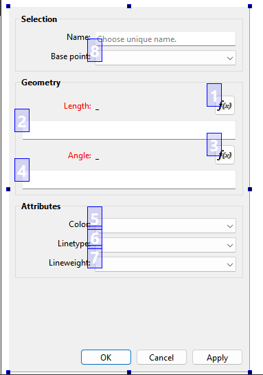
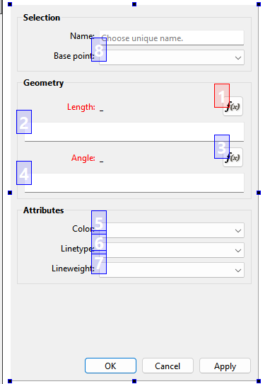
For ex: here’s how the Tab order is set using Creator for the Point - Length and Angle - where OK, Camcel, and Apply are 8, 9, and 10 in that order, and “8” is actually 11. Again a “QButtonBox” is handled by the class so you can’t directly set anything in Creator (including Tab order) other than what buttons to add:

I think that will work, & be worth the adjustment period :heart_exclamation:

:unicorn:

To be honest I think for most users there will be no adjustment as the majority pobably use the mouse. I never use the TAB’s in Seamly… too slow. IMO Tabbing works for data entry where you all you do is enter data on the same form all day long, :slightly_smiling_face:

Well… I suppose I may be the only one. But I really wouldn’t expect so. For me, using the keyboard is usually faster. I use Seamly2d on my laptop quite a bit, too, so I’m touchpad-bound. Which makes the mouse even more cumbersome, I suppose. (I have one of those Thinkpads with a “nipple” but I never quite got the hang of that, so touchpad it is.)

Well, at least from an accessibility standpoint this is also a big improvement for any disabled users. Thanks for picking this up so quickly!

I suspect so, but he is right that at least a little of it is that the TAB order didn’t make visual sense. I like using keys, because my brother & his friends traumatised me that way when I was a gradeschooler, LOL. But I’m more of a visuo-kinetic, so if I can ever talk myself into getting a touchscreen, I want to finally figure out git & see if I can get Seamly optimised for touchscreen. (Actually, if I were to figure out git, I might feel more free to shell out the dosh for a touchscreen… hmm…)

:unicorn:

Understood. After years of RA my hands don’t work very well with a trackpad. I use a wireless mouse on my laptops. :slightly_smiling_face:

Well I guess you could say I have an accesibilty issue… trackpad’s are not good for me , and typing getting harder. But yeah… like I mentioned I’m already working on all the dialogs so as I might as well cleanup the tab lists.

OK… this was driving me nuts for the past day and here’s the deal… the QDialogButtonBox handles the tabbing order for it’s own button vidgets. The thing is it’s focus has to be set to NoFocus - or the box widget itself acts as an invisible TAB positition. BUT here’s the catch… you set the tab order you want for the rest of your widgets - which the starting spot can be any one of the widgets. When you TAB it cycles through your widgets THEN the button box at the bottom. So… in the Point - Length and Angle dialog below the order willl be 1 through 8, THEN Ok, Cancel, Apply.

But there’s another thing that was throwing me off with other dialogs that have no value yet in a formla, i.e. an error so the TAB’ng was skipping OK and Apply.??? Because those buttons are disabled . Doh.

To include Ok, Cancel, and Apply in the midde of the cycle the QDialogButtonBox would have to be replaced by QPushButton’s for each button. We don’t want that though as the QDialogButtonBox dynamically sets it’'s button order at runtime based on the OS - as the button order is reversed on the MacOs so if QPushButtons were used the buttons would TAB rightt to left… without getting into setting all the TAB orders in Conditional code. NOT worth the effort.

BTW… here’s maybe a rather dumb question… what are the opinions on replacing the OK button with a Save button? An OK button should really only be used when there is nothing being saved or applied and it’s simply the only button to exit an informational dialog. “Save” implicitly tells you clicking it saves the dialog (data).

So for ex:

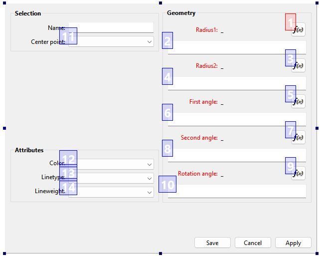
Hmmm the 2 frame dialogs present somewhat of a challenge. Not sure if we should swap the left and right sides so it TAB’s like reading a book?

Right! Yes, that sounds like diverging from the default code too much. Cycling throught all fields first and then OK, Cancel and Apply would also have a kind of logic in it, but jumping from “Base point” to OK then seems a bit unexpected.

I don’t really know much about this, but wouldn’t it be possible to separate the initial focus from the actual tab order? I.e. have the tab order actually start with 1. at Name and just follow the logical order, but have the focus be on Fx first? AI tells me that’s possible with something called “ui->buttonFx->setFocus();” in the .cpp file. But, you know, being AI I’m sceptical :sweat_smile:

That makes sense to me! But then I’m quite new to this software :person_shrugging:

I would say top to bottom for the left side, then top to bottom for the right side, here! That feels the most intuitive. I found these guidelines for this kind of thing: https://www.w3.org/WAI/WCAG21/Techniques/general/G59

This was also an interesting relevant read on keyboard shortcuts in general: Keyboard - GNOME Human Interface Guidelines

My intuition is that Save & Apply mean the same thing, so I’m advising against changing OK to Save.

Having grown up on MacOS 7.5.3, I intuitively regard OK as “save & exit this dialog”, & Cancel as “undo any changes & exit this dialog.” However, in my early days of using (Red Hat) Linux, OK did merely mean “close this dialog” & I was introduced to the idea of an “Apply” button.

Since the Cancel button doesn’t cancel/undo any applied changes, I’d vote for “Save” or “Apply” & “Close” or “Done” as the only buttons down there. With a slight preference for “Save”, “Close”. Except, Seamly is a creative program, & MacOS has been positioned as the OS for “creatives”. So I’m voting to go with the Mac Standard.

:unicorn:

The cancel button doesn’t undo any changes? That doesn’t make much sense, why is there a cancel button at all, then?

As a true creative Linux user the use of Macs in the creative field has always been a source of frustration for me :sweat_smile: I really dislike the closed ecosystem there.

Save and apply really don’t mean the same for me, on computers. It’s long been established that “apply” merely demonstrates the effect of your changes without saving them yet, I’d say. (And if you then press cancel, it should revert any changes.)

I would say that OK and Save could be used interchangeably, but I would also agree that “Save” better captures the effect in this case.

Can’t do anything about that other than starting at the top widget and working down. Qt is goingto build the button box and set it;s TAB’s after the other TABs are set.

Yes. I can set gthe TAB order top to bottom, then set the focus to one of the widgets… for ex: an fx button, where you just need to hit Enter. Or for ex: in the Arc dialog in most cases you want to just enter a radius and not openthe fx editor so by setting the focus to the radius formula you just need to start typing a value.

I think this is the best solution.

Since Winldows the most widley used OS I tend to follow Windows guidelines.

As per Windows guidelines…

Button Functions

  • OK: Applies all pending changes and closes the dialog box. It acts as a generic commit action when specific verbs are unnecessary.

  • Save: Commits specific file or record changes and closes the window. Modern guidelines prefer specific labels like Save or Save Changes over generic ones like OK when modifying distinct content.

  • Cancel: Discards any uncommitted changes and closes the dialog box. It maps to the ESC key by default.

  • Apply: Saves or commits current changes without closing the dialog box. This lets users test or view adjustments before making further edits. It is typically disabled until a setting is modified.

That being said after looking at it I’m leaving it as “OK” for now. Switching to “Save” means all the undelrying code to handle the QDialogButtonBox::Ok signals would have to be changed.

See Cancel above. The Cancel button closes a dialog without saving. An ‘Undo’ button would undo applied changes.

Since we don’t have an Undo button in the tool dialogs, and you want to undo applied changes… close or Cancel the dialog and use the Undo button / menu / Ctrl + z

Oh, no, yes, I think we mean the same thing—Cancel undoes any changes made while the dialogue is open, not anything before that point. That’s Ctrl+z terrain.

I think the Windows and Linux guidelines will be largely the same, by the way… I just didn’t come across those :sweat_smile:

The Mac conventions can be different… which as a new Mac owner I’m finding out. That’s where underhood the Qt handles the differences in classes like QDialogButtonBox. I’m still trying to get used to button ordered reversed, or the window close button(s) on the left, or a separate “App” menu that incorporates the normal Windows “About” menu items. :roll_eyes:

What’s really annoying though is Windows apps that use Mac conventions… like Inkscape:

I just think both Windows and Mac are horrible :face_savoring_food: