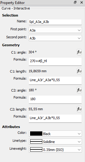
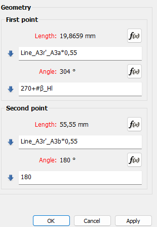
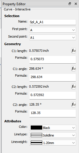
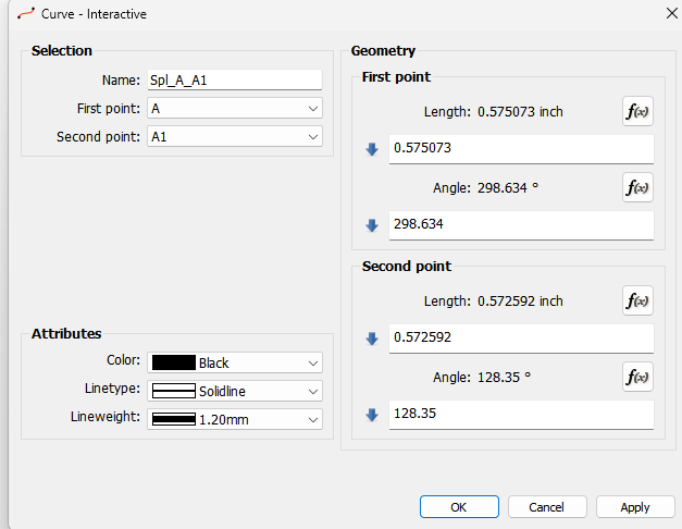
Hi guys, the order of length and angle is different in the properities and editor. Maybe is possible to change it I am quite often make many mistakes as I am working. Gr Michael
Can you be more specific as to which tool(s)?
Sorry for the late reply and not weak description.
My question was about curve handels. In the editor is the order angle than lenght. If i open the properties of the curve the handle definition is lenght than angle.
Gr
Michael


Yes, one must just be aware of these discrepencies. @Douglas is in the process of tidying up the program, but to change a small order like this, that really doesn’t change the functioning of the tool, can disrupt things further down the line. I just take care to read which one i’m about to change.
Fixed. Simple case of switching the order in the Property Browser. Should be in next weeks release.


I should note that at some point I will figure out how to add the control point data to the Spline tools in the Property Editor. Since the Property Editor is a 3rd party library that builds the dock form on the fly - it doesn’t have direct access to the the tool data. So it will be a bit trickier to figure out how to switch which path point to edit the control points for.
Can’t it be a list of control points with a scroll bar if it gets too long?
Thanks for ur effort. It is really only a minor point. If it takes to much time we have to live with it. Gr.
That’s not the problem. When you have a spline, there can be any number of points - not just 2 like with a curve. In the dialog there is the list widget where you can select which point to edit the control points for. That all happens in the dialog cpp. To do the same thing in the Property editor, all that code to display, select, and switch the point and associated control points - would have to be duplicated within the Property Browser as it has no direct access to the dialog and tool code. I did look at the Spline dialog real quick, and thought why are the points in a list widget, when they could have just as easily been in a combobox dropdown - saving a lot of space?
Had the app been programmed the way it should have been… there would have been a widget for each tool that is shared with a single tool dialog and the Properties dock. There would be no need for the 3rd party Properties lib, and the dialog and Property dock would look and function exactly the same. But, that’s not the case, so we’re kinda stuck with it as is without a lot of refactoring.
Thanks, I saw that the order in property order is fixed.
Yes… it’s now fixed with the latest release. Got delayed a week as we had a lapse in the Windows signing causing the CI to fail.