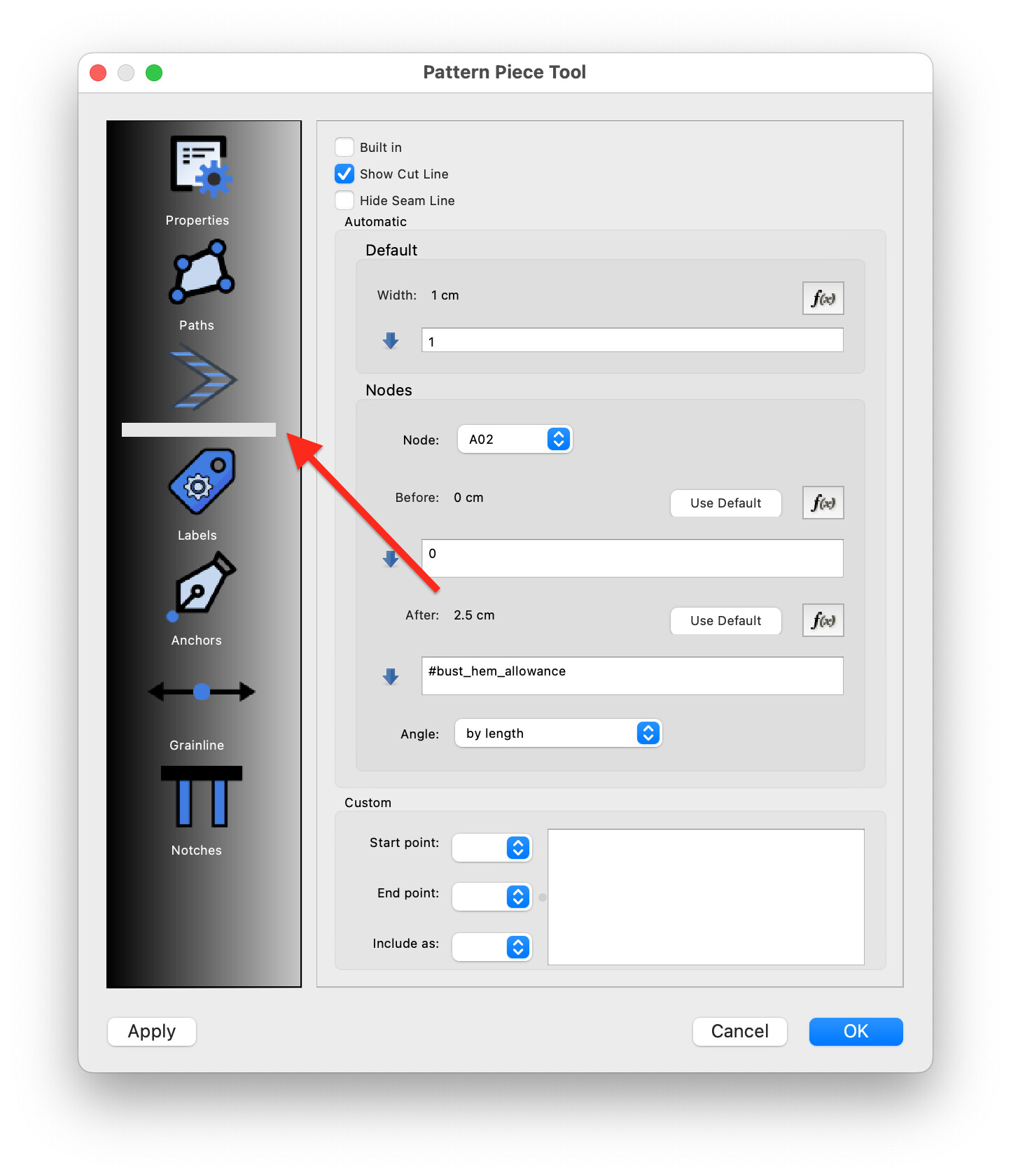
Seamly2d 2023.6.19.201
MacOS 12.6.6
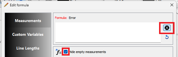
It happens with all properties: paths, labels, etc. When you select it, it becomes white
Seamly2d 2023.6.19.201
MacOS 12.6.6
It happens with all properties: paths, labels, etc. When you select it, it becomes white
Oh, dear. I’m sure @Douglas will be along shortly to have a look.
Yes I had a look… I may have an answer.
Update for Seamly 2023.6.26.210 MacOS 12.6.6
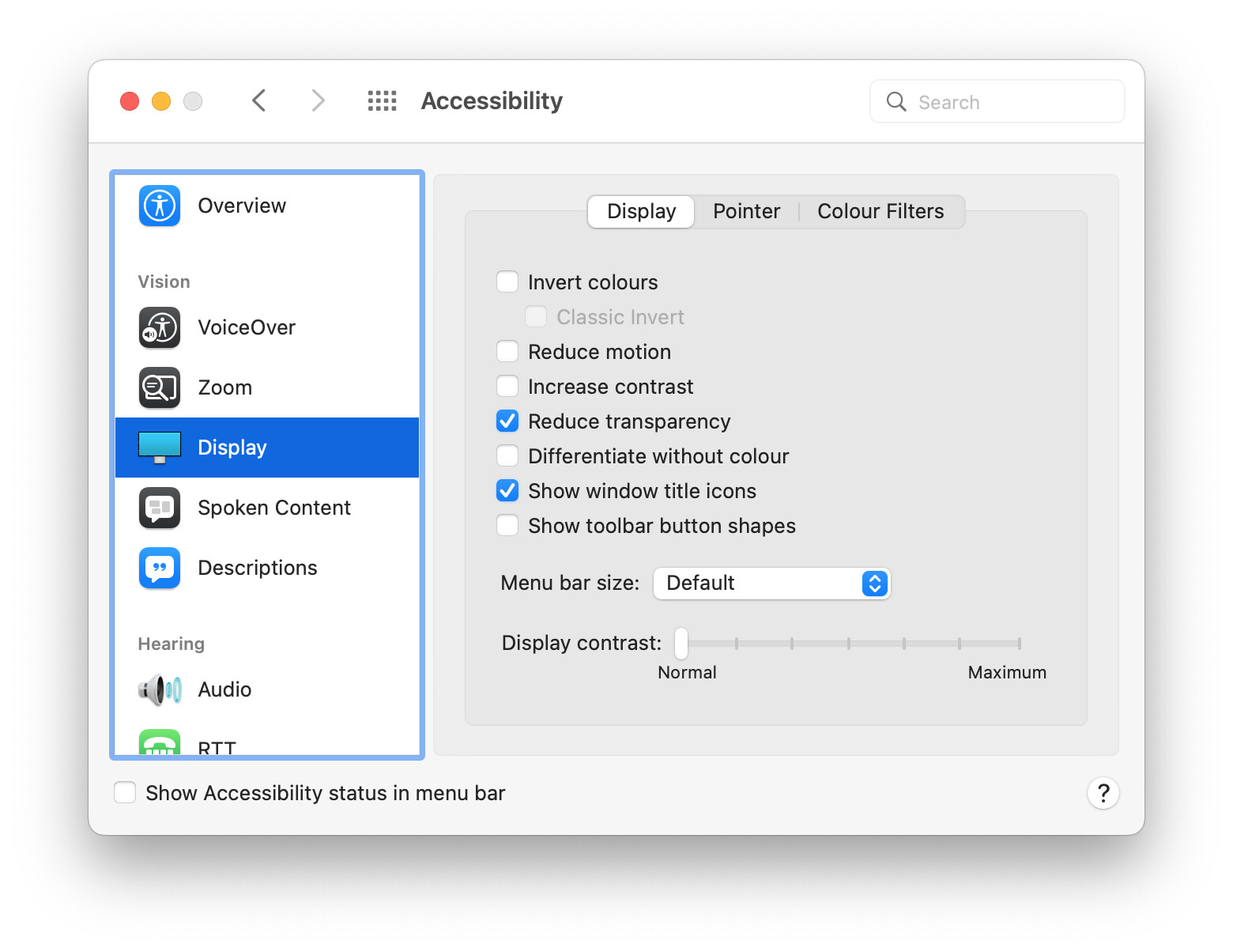
Please see below my Display accessibility settings, could they interfere with the incorrect renderings?
I don’t believe so. Those 2 issues appear to be more about layout issues within the dialog form. It can be tricky to make sure widgets are nested in layouts correctly in order to expand and shrink dynamically. I’m sure there are some case where the MacOs handles the layouts differently, or as the case may be more srtictly, thus differences from a windows build. I’ll take a look at the form and see if I can see any anomolies.
Thanks,
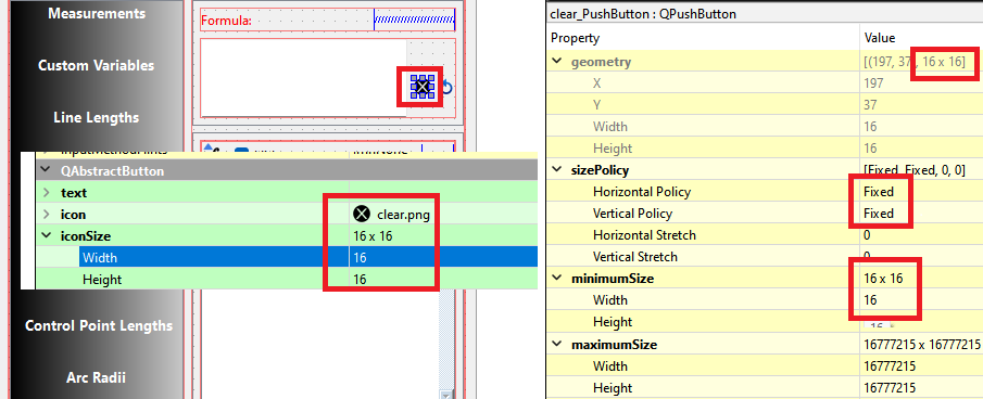
Just to add another detail, it looks that the target for the “x” button is very small. That is the button has a normal size, but to make it work you have a very small zone to click on.
Unless the MacOS is doing something different, the clear button should be 16x16 pixels. The same as the reset button next to it, and the same as every other pushbutton that’s 16x16. Here’s the form editor… there is nothing else to set that would change the size of the selection size of the button.
unless you hit the x button in the center, it doesn’t register. The clickable area looks smaller than the button graphic:
The graphic looks trimmed on the right, could it be related?
on my mac it’s rendered at 32px, I guess it’s the retina display
![]()
On Seamly 2023.6.19.201 this problem doesn’t occur, maybe some other changes, otherwhere?
That could be… as the icon size is 16x16, and thus the selection are is 16x16. Like I said, if this button it doing, every 16x16 button should be doing it.
At any rate I did make some changes that should fix the original 2 issues… and I rearranged the clear and reset buttons vertically which gives more space for the formula edit box.
If it helps:
x button in properties dock works as expected:
No it doesn;t help. What you’re showing is a QLineEdit (like below) that has a clear button property.builtin… and because it’s part of the widget the X is inside the box. (Doesn’t show in the form editor)
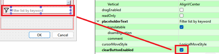
The formulas use a QPlainTextEdit (that wrap multiple lines) which do not have a clear botton property. I added a QPushButton for the formulas and call my own clear() routine to clear the text. I do the same thiing with the reset… the formula text is saved upon entering the dialog, and if the reset button is pushed it calls the routine to reset with the saved text - as opposed to undo’ing the last edit. In other words- those 2 functions are value added by me that did not exist previously.
it’s something related to changes in the latest release, since in the previous one the rendering of the dialog was completely different (more Mac-like if you ask me).
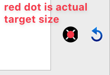
The button clickable area was a lot bigger, see in the gif, a big rectangle appearing pressed and giving feedback.
Seamly 2023.6.19.201:
let me know if you want some other tests somewhere else in the UI to help pinpoint the problem
Because the button was bigger, the icon is the same 16x16 size… which is the size of a clear button in a line edit box. So I’m curious why you’re complaining about this one button and not the 100’s of other line edit clear buttons?
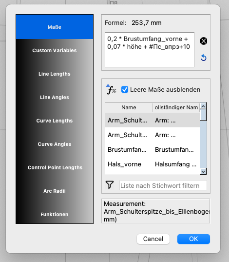
Thanks to @csett86 he has confirmed for me that indeed the changes have fixed the diialog display on Macs. High lighted tabs on the left are no longer a big white block, and the list is no longer displaying under the filter edit box. Also based on his query about the (default) width I changed it from 440 px (as per below) to 600px wide. You can still size it down to 440 or up to the full width of the screen if you prefer.
I’m not complaining, I’m trying to help you or at least I though I was being useful.
I opened a previous version of the software to test in the same place to show you the difference, in this case the previous version was more usable.
All this to contribute to the bug squashing.
Fix is in for the original post regarding this dialog as well.
Not when you’re nitpicking about the size of a button… or what chars are allowed in point names.
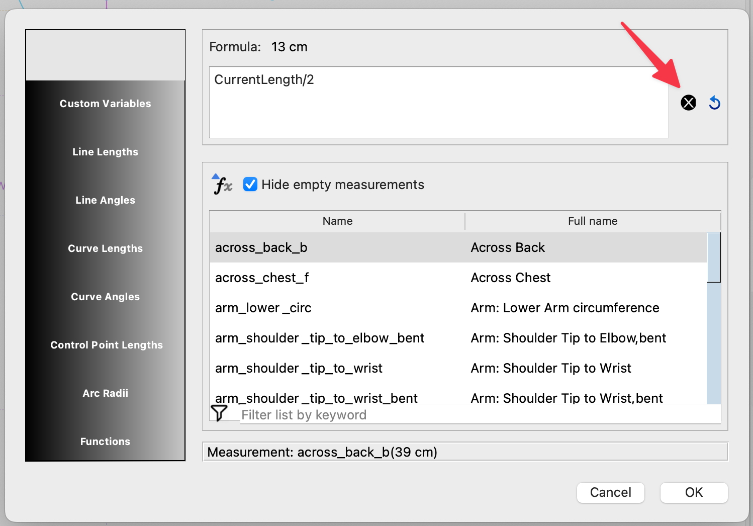
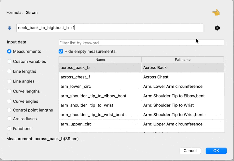
Just to be sure … I looked at the most current develop branch build to check the fx dialog and here’s the selection size of the fx clear button - compared to a checkbox on the same page. If you can click the checkbox, there should be no issue with the clear button.
This afternoon’s current artifact can be downloaded here:
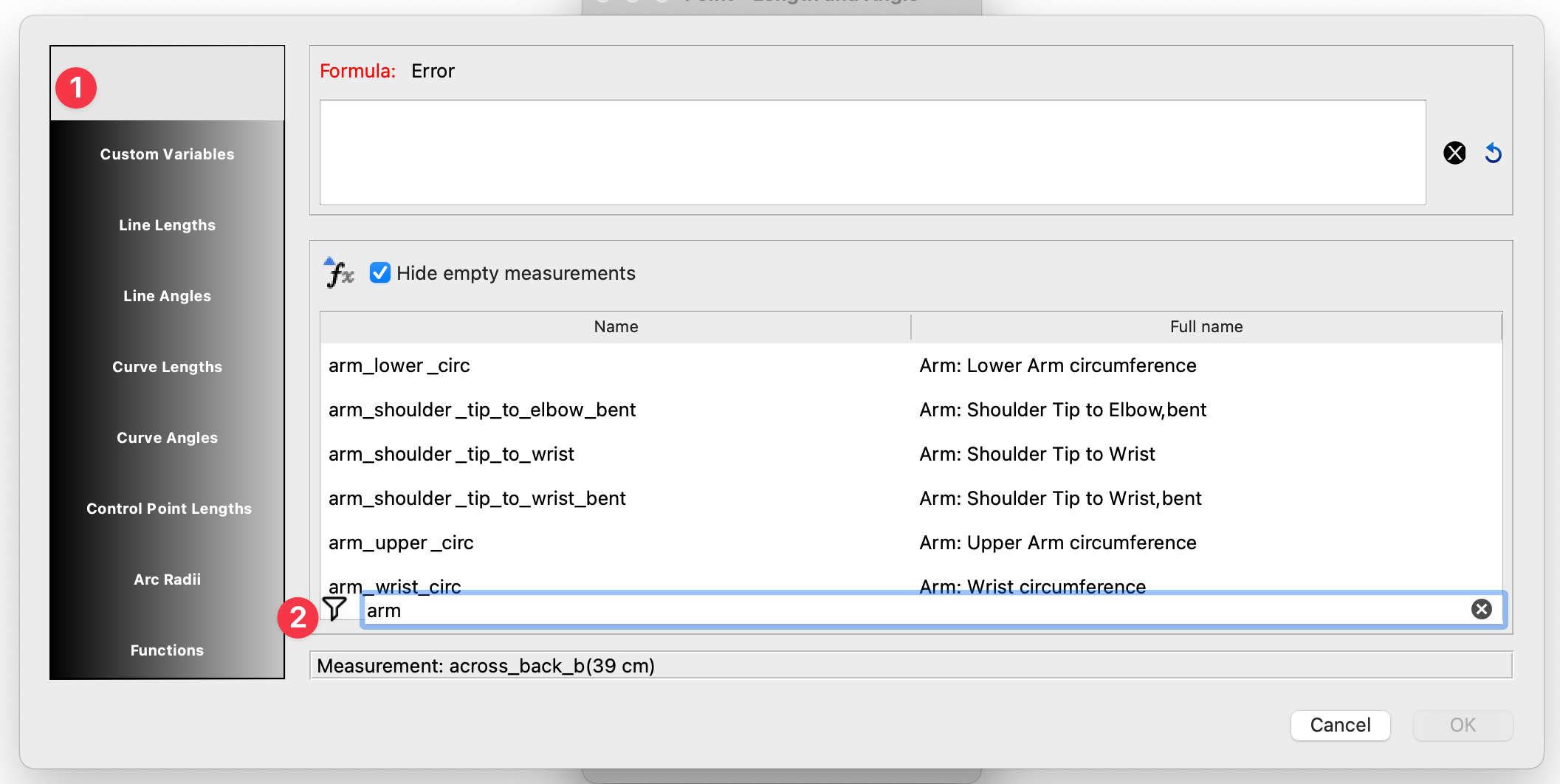
I could ask the same thing why you reported issues in the FX dialog not related to the Pattern Properties dialog here? I bring it up because it goes to a pattern of reporting non issues.
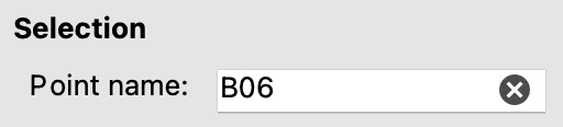
I kinda do take it personally. I don’t like my time being wasting on non issues. For ex: Chars allowed in point names. I took time to explain why it is what it is, why it’s not going to change anytime soon. Yet you persisted in implying the behaviour should be different, and that the “naming of points it’s too rigid”. There is nothing wrong with the Point names only allowing _@#. That goes for the clear button… there is nothing wrong with it. Likewise there is nothing wrong with no color attributes for certain point tools.
I don’t mind reports of real bugs, in fact I encourage it. What I do mind is reporting things that do work, just not the way in the way you want them to.
because I thought it was related. I don’t code.
You could have responded with a polite invitation to report each problem separately because you prefer this way.
People work differently from you. Usually there is a discussion about pro and cons. In the case of point colors some people might thinks it’s inconsistent behaviour, some other people might prefer to set different colors for different points.
From my point of view it was a bug, because I see the color option for all other points. It’s expected behaviour, because of a design choice? Then just say so and the conversation can move to a different field: design and preferences about how a software should behave.
Regarding the clear button, I reported that the target click area is smaller than the icon itself. I think it’s a problem.
I have no beef with you, and I appreciate the work you do on Seamly but If you don’t recognise my will to improve the program and mistake it for a personal attack there is nothing I can do.