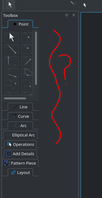
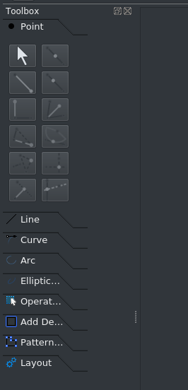
the toolbox, has a fixed size and does not take advantage of the width. seamly2d-git v0.6.0.1.r355.g9af57415f-1

the toolbox, has a fixed size and does not take advantage of the width. seamly2d-git v0.6.0.1.r355.g9af57415f-1

This a known issue… normally there is no need for the dock to expand, unless a larger font is chosen to override the ui form. I’m looking into this.
That being said Archlinux really seems to be mangling the toolbox… the toolbuttons are not only bigger than they should be, they should be square. There should be no toolbox page scroll bars. Also the page tabs all look weird sizing to the text???
if I use the Appimage, it looks more consistent.

Yes it is… except as you see the tab text is now elided - due to the fact some programmer(s) figured using “fancy” tabs instead of the designed toolbox page labels was a good idea. In order to see all the text you would have to make the toolbox width 50% wider… losing yet more workspace. 
Which is why I put the toolbox in a dock in the 1st place - as you can hide it, and use the toolbars or toolbar toolbox instead - or if so inclined to learn the keyboard shortcuts - leaving more workspace.
BTW… I’m trying to figure out if I can place the toolbox in a layout in the dock to get it to expand.
an example of the behavior in Kile