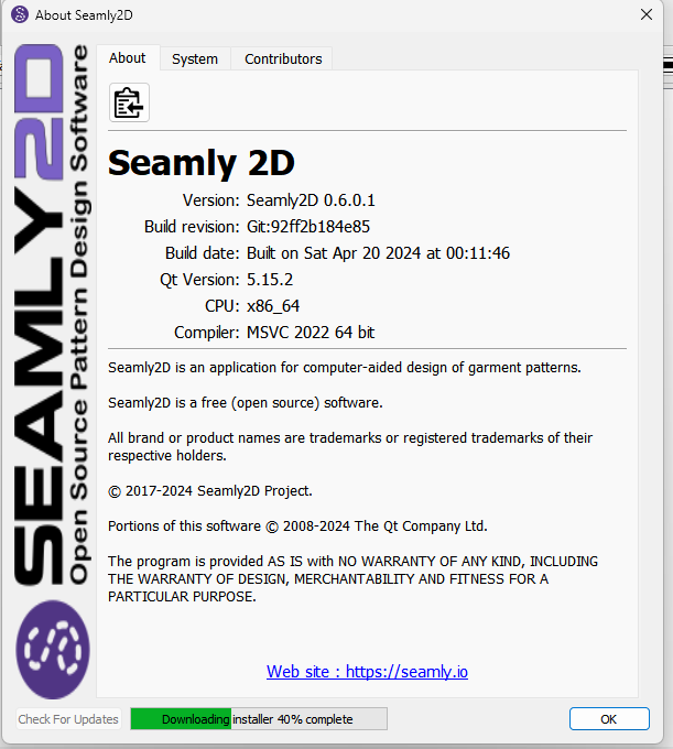
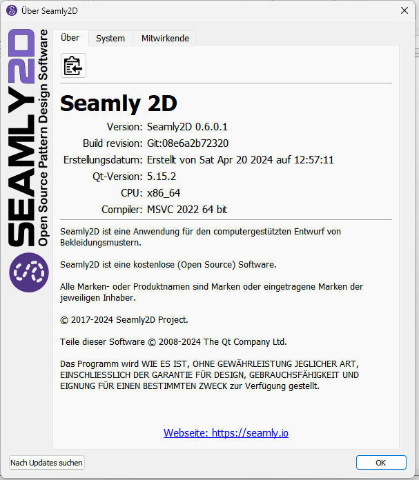
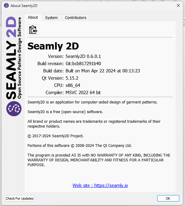
About - Displays the basic build and legal information. This tab also adds a Copy to Clipboard that copies the build and system information to the clipboard that can then be pasted into for ex: a bug report.
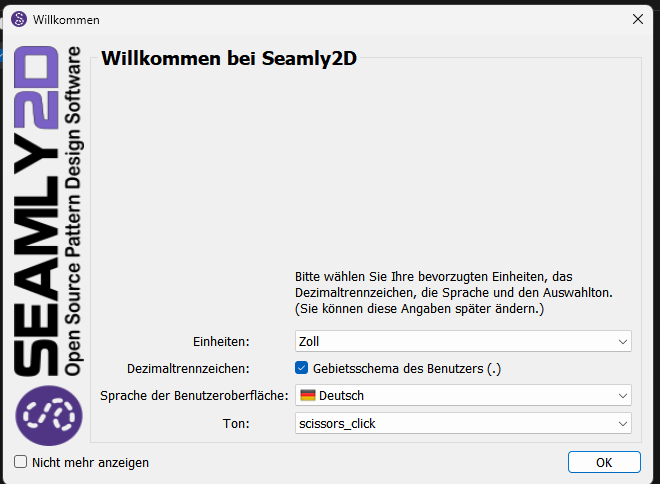
Moves the downloading widget to the button box area .
Now displays the proper compiler version for MSVC when MSVC 2019 or greater.
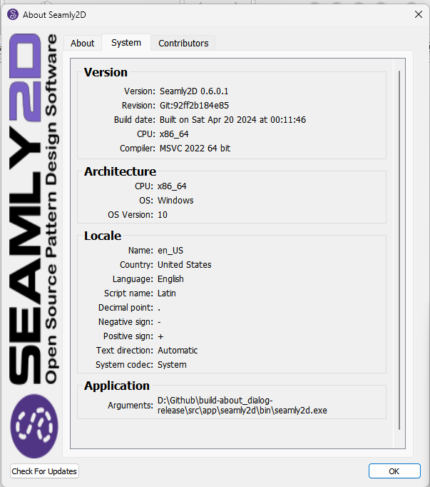
System - Displays extended information about the build and machine system.
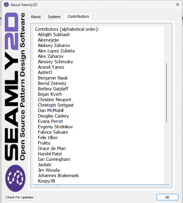
Contributors - Displays the list of project contributors. Fixes the list so it is actually in alphabetical order. Updates the list with new contributors.
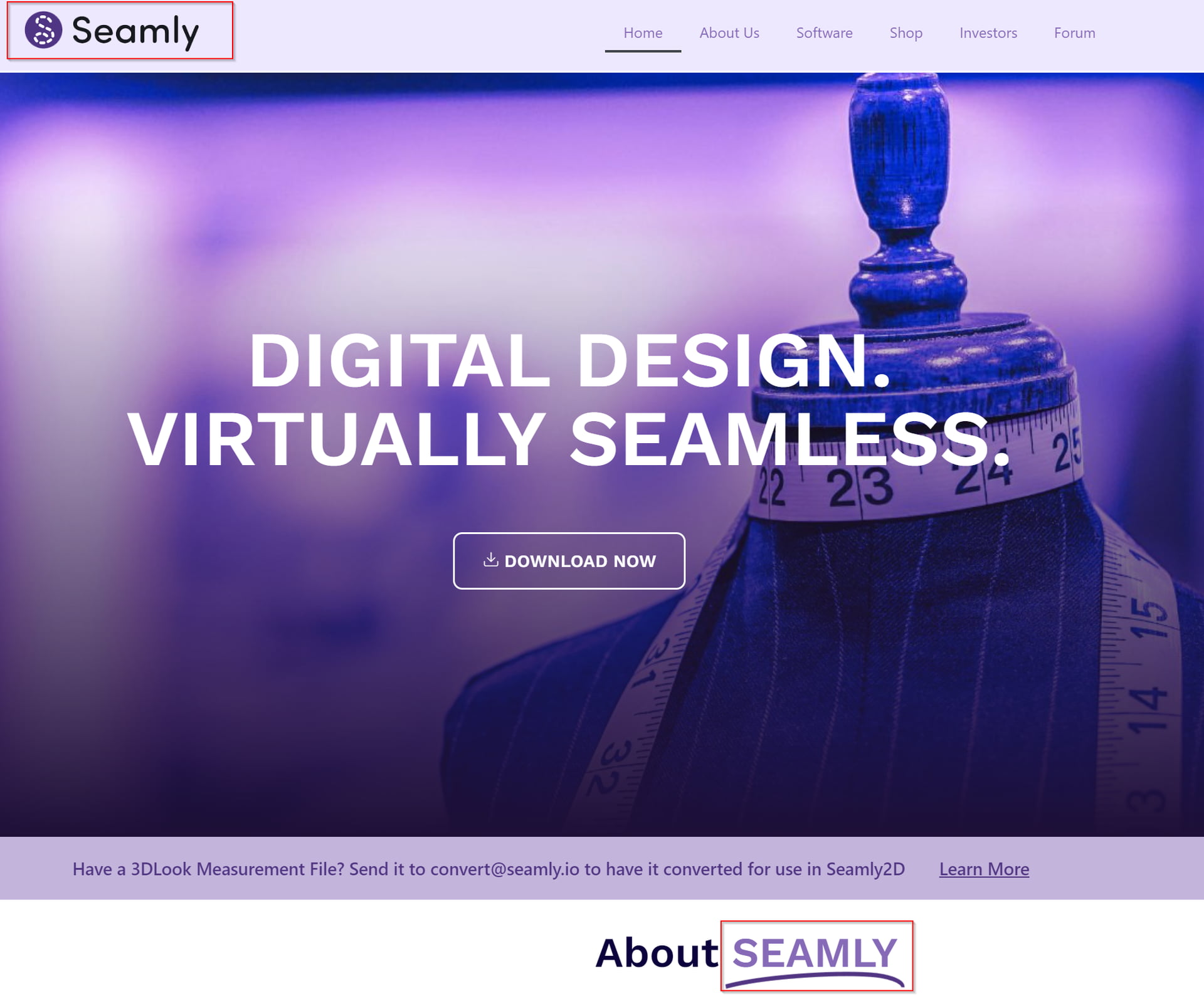
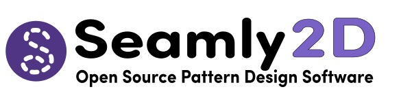
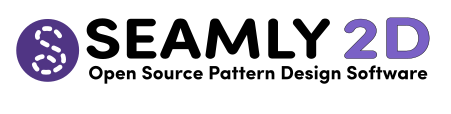
I like it. But personally I think the left logo band is over the top. For me it’s to big and he Seamly2d logo seems streched and what font you used for “SEAMLY2D”? Is that part of the logo? Because looking at the seamly webpage I can’t find that specific font.
I don’t want to spread confusion. I was just curious where the original lettering came from.
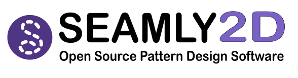
Personally, I like the new design (Sofia Pro Soft font) better, but would also copy the spelling of the website here, as “Seamly” and not “SEAMLY”.
But I agree with you that we should concentrate on the appliocation and the more important points first
I love the warm feminine energy of the Sofia Pro Soft font. The other font has a more brutalist/industrial masculine energy which I find less personally appealing.
But what makes a brand isn’t the logo & fonts any more than a person is their hairdo or makeup – The facade is important to say, “Yes, this is me,” at a glance, so Douglas & Grace are absolutely right that we should should stick to a style. The brand is the story of what Seamly means.
In short, what the about dialog needs is a tab giving the story of Susan’s epic quest of learning French & advanced mathematics in order to bring computer aided pattern-cutting to the small atelier, the struggle to make it a viable product, & the lead devs who have shared the vision.
It needn’t be much more than the Author section of the vim man page:
AUTHOR
       Most of Vim was made by Bram Moolenaar, with a lot of help from others.
       See ":help credits" in Vim.
       Vim  is  based  on Stevie, worked on by: Tim Thompson, Tony Andrews and
       G.R. (Fred) Walter.  Although hardly any of the original code remains.
Just keep in mind that Sofia Pro Soft is an Adobe font. It’s not free. Not everyone is going to have it. If you don’t have the font, you can’t edit the SVG to create the PNG used in the UI forms. We also can’t use it directly in the UI forms. That’s why it’s smart to stick to standard fonts that are available to all OS’s. That’s the problem with Web developers that don’t consider these issues.
There’s probably a similar free font. Which is fine for the logo image, but we still want to stick to the default system font for ui forms, as a user needs to have the font on their machine to work. This was a big issue with the MacOS as fonts like Segoe UI(which Creator for some reason defaults to) or Times was causing machines to freeze.
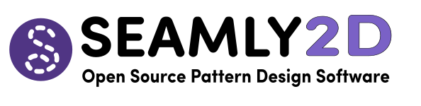
The Arial has a similar vibe, slightly more androgynous, (which might be better?) but still very much not brutalist (which is definitely a good thing IMO.) Arial Rounded Bold might be closer? But the pricing & lack of subservience to the Adobe-industrial complex fits Seamly’s brand better.
That was my thought too… I checked - that is Arial Rounded Bold. I could play with the stroke to fatten it up a bit, but I think it’s close enough. The main difference is the M, but IMO a minor thing.