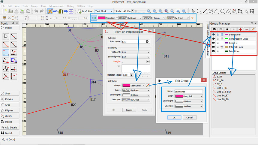
It would be nice if the program could remember the line type and line color that I’m using rather than always defaulting to a solid black line. For example if I tell the program to draw a dashed line in Goldenrod, that appearance would continue automatically on all the subsequent lines I draw until I change the line appearance again.
I have this feature in my personal fork that I will port to Seamly2D in the near future. Besides keeping track of the current pen style, it’s integrated with “Groups”, where each group can have it’s own pen style. By simply choosing in a tool’s dialog you can add it to a group, and either use the current color, the ByGroup color, or another color. I also have it worked out where you can choose to link the current pen style to the groups, so by simply choosing what group to add a new tool it automatically chooses ByGroup for color, (lineweight), and linetype. The pen style toolbar defaults to the prefs set in the preferences… which it starts with, or can be reset to by clicking the reset button.
That is going to be a very enjoyable and comfy improvement 
Yes it will be. Even just implimenting the current pen style (as in your suggestion) is a big improvement as it improves the work flow immensely with having new tools default to the current pen. Currently I have it setup that the only way to change the current pen is via the pen style toolbar - which means it has to be visible. If you (or anyone else) have any suggestions in any additional ways we might set the current pen without using the toolbar - feel free to suggest away. ![]()
Once I track down a slight bug I have with the Point Name features I’ve been working on… I plan on working on the current pen toolbar and updating all the tool dialogs. After that will probably come the updated handling of groups.
Sieht man die Farbzurodnung später auch den Gruppen an?

Yes. In my fork I redid the the groups dock, and there is a color icon for each group. Actually I changed the paradigm of groups … instead of creating objects and creating a group on the fly when adding objects to a group, I have a group manager where you can create groups… edit a group’s properties like color and line type. Then when you create a new tool object you can select which group to add it to. You can delete or move an object to another group by edit the objects group property. I also retained the existing manner of adding an object to a group via the drop down context menu.
In recent discussion on coloring a tool’s point name text… when I port the groups to Seamly2D I will probably impliment some sort of group style presets, so that a group of users can use a standard style preset so everyone would be on the same page when sharing or working on patterns. So if one where to say foe ex: the powder blue dashed line… might mean a construction line - which maybe translates to an internal path in piece mode. Will definitely wants some input when I get to adding the new groups features.
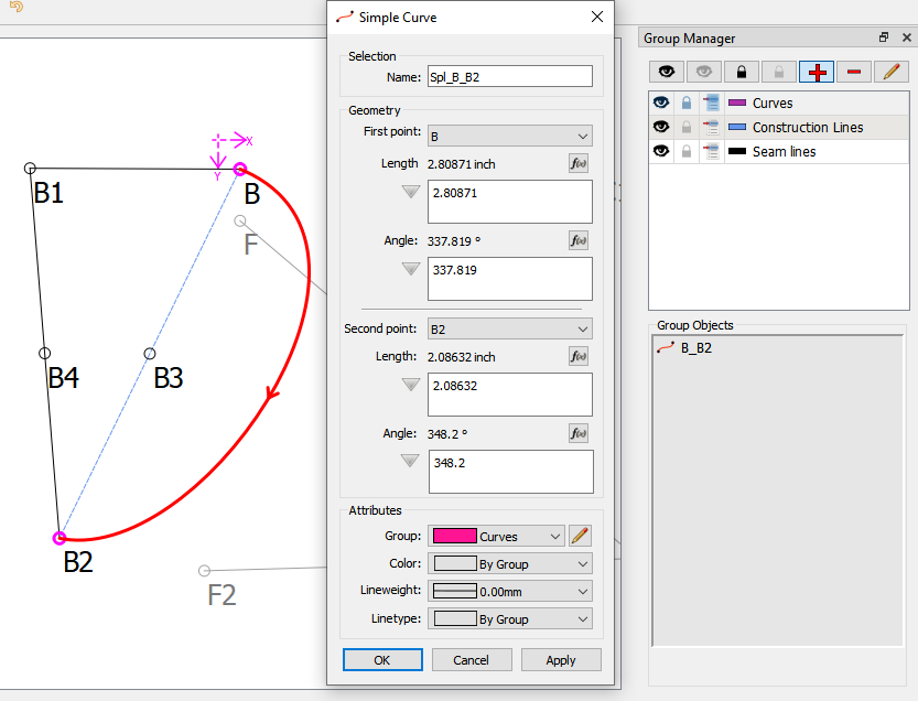
Here’s a screencap showing the Group manager dock… each group list item has a color icon indicating the group color. Or may change the icon to reflect the color, line type & line weight? You may also note that there are lock icons so you can lock a group. Also note that there is another widget that displays a list of objects in the group. Eventually the idea is enable drag & drop so you simply could drag an object into a group.
Das hört sich super an. Wann meinst du kann man damit arbeiten?
![]()
Once I finish work on the Point Name Text improvements… which still has one slight annoying bug I’m trying to squash before pushing the changes, and fix a sizing bug I discovered in the pattern piece labels that I thought was related to the label font - which I separated from the Point Name font - but turns out to be an existing issue non font related… I plan on updating all the tool dialogs which will include the addiion of a link to a new Pen Style toolbar that will address the issue of this topic. After that I will then add the improvement to the Groups. So… maybe a few weeks from now. provided I don’t get side tracked with some other bug issues. 
Vielen Dank für diese tolle Arbeit * fröhliches Schaffen
![]()


 LOL, great work, @Douglas It’s not only my fingers that are crossed.
Another nice feature would be to stay in the last command and not immediately switch back to ‘Tool pointer’.
Agreed… but that’s a separate issue from a current pen style.
The app does store the last used tool - which is accessible using the Ctrl L key shortcut. I suspect that it may get a bit tricky in spots as the cursor at times needs to switch back to the arrow. In other words it will probably take a bit more robust tracking of the current cursor state. I would also tend to make it an option in the prefs to stay with the last used tool or revert back to the arrow… if only for maintaining the current work flow for those that are used to it.
That’s just plain L which goes to the last tool, ctrl L goes to the Layout screen
I was thinking is it ctrl or not? Funny thing is if I was sitting at the laptop I would just automatically hit L without thinking… kinda of like you know where you’re driving, but can’t describe every street name to someone else. Lol
Haha, yip! my fingers know best. 
Well, I started on the issue of creating a current pen style… got the linetype and penstyle classes added, a default pen style setting in the prefs, and have successfully added a pen style toolbar to the main window. Now for the fun part… redoing all the tool dialogs as well as the properties editor- where I can also remove some redundant code. RT for some reason believes that straight lines have a line type and curved lines have a pen style, so the code is doubled.
Anyhow, I’m debating whether to add a line weight (width) now to the pen style, or as a separate issue.
Got the first tool dialog reconfigured… as per a recent discussion in another topic I’m going to refactor all the tool’s names, associated filenames, class names, icon & cursor names, tool tips, menu items, etc so they’re consistant across the board. So instead of having this (V) mess:
- VTOOLENDLINE
- vtoolendline.cpp
- dialogendline.cpp
- vistoolendline.cpp
- segment.png
- point_at_distance_angle_cursor.png
- “Point at distance and angle”
it will be something like :
- PointLengthAndAngle
- pointlengthandangle_tool.cpp
- pointlengthandangle_dialog.cpp
- pointlengthandangle_visual.cpp
- pointlengthtandangle_icon.png.
- pointlengthtandangle_cursor.png.
- “Point - Length and Angle”
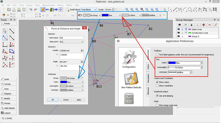
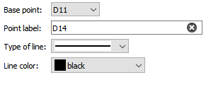
So… Here’s the Pen Style Toolbar and the Preference dialog to set a default pen that the toolbar is set to when the app starts. BTW… from a coding standpoint, I created new subclasses of the combobox to handle the color & linetypes, where instead of having to code the comboboxes on the fly, you can simply add and promote a combobox to a ui form in Creator.You may note that the comboboxes will now have a consistent look with a same sized icon w/ item names… not this mess:
The Pen Style Toolbar also contains a Reset button (Alt+R), that will reset the current color and linetype combo boxes to the default settings.
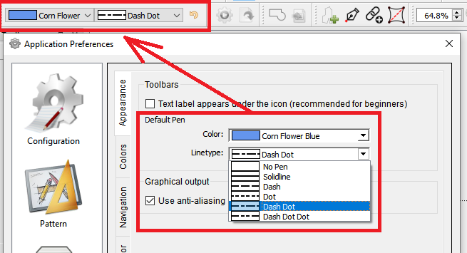
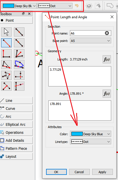
In what is a small, and yet big change to the workflow is that now when adding a new tool, the color and linetype attributtes will initially be filled by the current pen style displayed in the Pen Style Toolbar. So if for ex: you want to draw a series of Dot / Deep Sky Blue lines, you won’t have to keep changing the combo boxes from Black / Solidline with every new tool added.
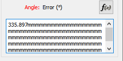
Below is an updated look of the former “Endline” AKA Point at Distance and Angle tool… the Point - Length an Angle tool. All the new dialogs will follow a reorganized clean layout of Selection, Geometry, and Attributes. Eventually this layout will replace the inconsistant look / opertion in the Properties Editor. Gone are the useless giant ![]() signs, as well as the “grow” buttons that serve no real function other than taking up dialog space and adding junk to code base. Normally a text box widget (set with word wrap) will automatically add (as you type) a scroll bar if more text lines are needed, so I have no idea why the expanding junk is there? Also to note, currently, if you type past the 1 line of text WITHOUT clicking the expand button you may get:
signs, as well as the “grow” buttons that serve no real function other than taking up dialog space and adding junk to code base. Normally a text box widget (set with word wrap) will automatically add (as you type) a scroll bar if more text lines are needed, so I have no idea why the expanding junk is there? Also to note, currently, if you type past the 1 line of text WITHOUT clicking the expand button you may get:

NOT ACCEPATBLE. Now you will get:
Only about 34 more dialogs to go. 
