Update Tool Dialogs and Properties Editor

Though I’ve been busy the past month working (without our employees) and dealing with my 99 year old mother with a broken hip and nursing home… I have been steadily updating the tool dialogs and the Property Editor. To this point I have all the “Point Tools” redone.

While most of the work has been refactoring the code to have naming consistant across the tools, I’m going to present here a Before & After look of the Dialogs and Property Editor to allow for any input / comments.

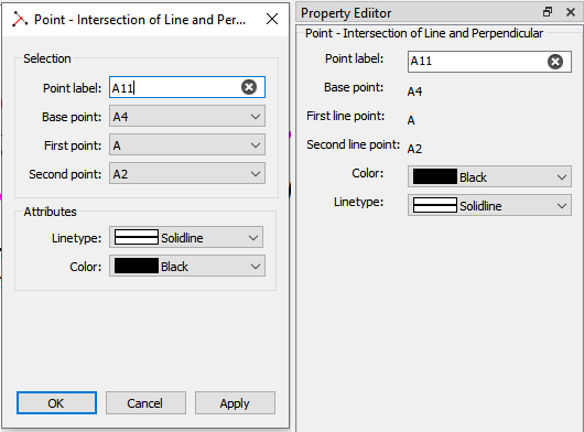
I’d like you to keep in mind one major constraint… keeping the names / titles concise. While verbose dialog titles may more describe a tool’s function, it won’t help if half of it gets elided in the title bar (or Propety Editor). I’m trying to follow the convention of < Tool group > - < Type > < Arguments >.

For example “Point - Intersection of Line and Perpendicular”.

So lets begin… The 1st dialog is the pefect example of why the dialogs & Property editor NEED to be updated… there is absolutely no consistency in terminology, position or order.

Is it a single point or base point? Is it a coordinate or position? Is it on the left or on the right? basepointbefore
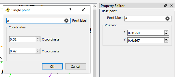
It’s the Base Point, with the widget labels ALWAYS on the left. and as usual - there is no useless ? help button. BTW… some may notice the Property Editor allows 5 decimal places for the coordintaes while the dialog only 2… I have changed that to 5 as well.
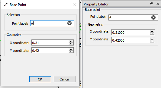
basepointafter

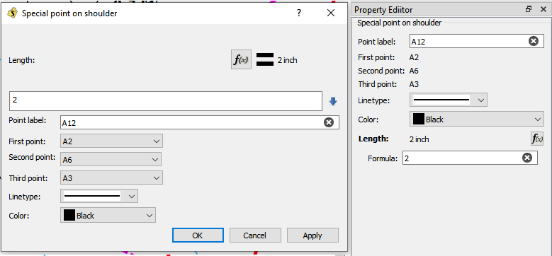
Again… no consistency between the order of fields between dialogs and the Property Editor. lengthangle_before
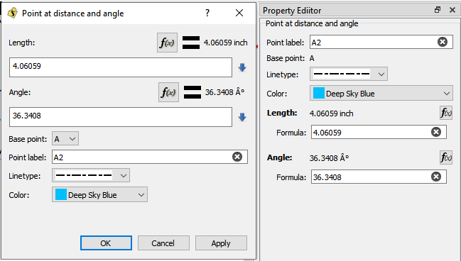
The updated look will always follow the layout top to bottom of Selection, Geometry, and Attributes. Also you may note that the “Linetype” dropdown now contains the type name… Like Dash Dot.
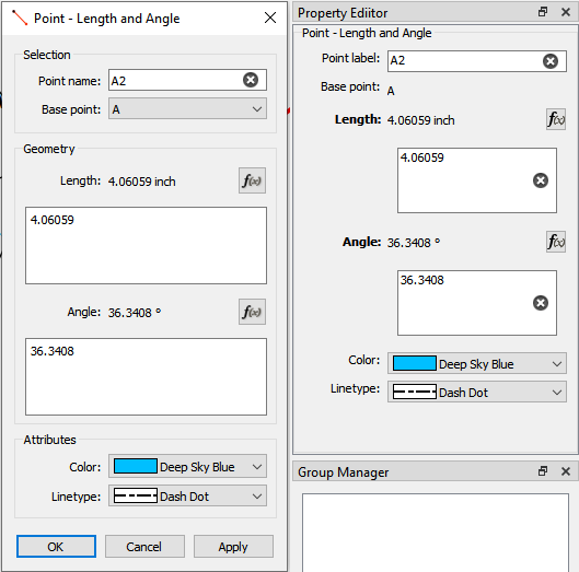
lengthangle_after

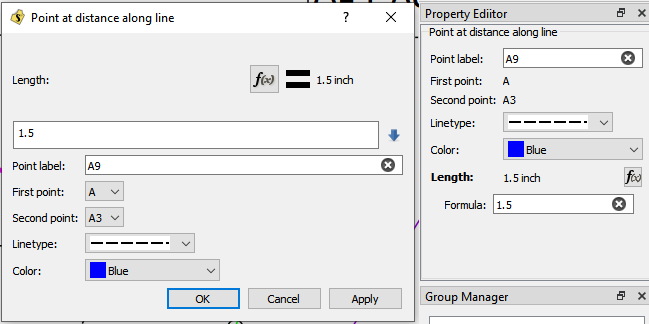
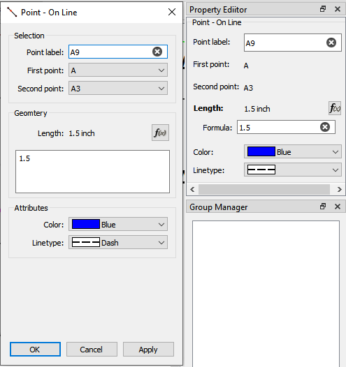
This dialog is a visual overload! online_before

And cleaned up. Just a note… the Midpoint tool also uses this dialog, but the XML tag will be onLineMidpoint vs onLineLength.
online_after

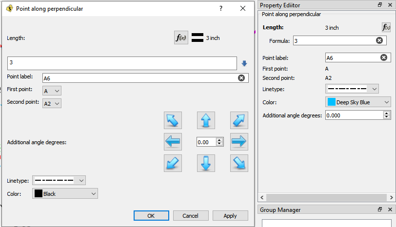
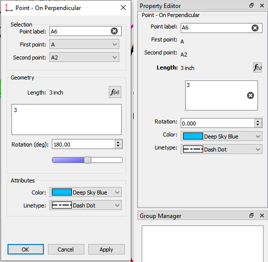
Ok… this is probably the worst Dialog in the app… it takes up a lot of space, it’s all over the place, and the arrows are confusing. Not only that the tool is named in the code as “normal” ??? I see NOTHING nornal, :wink: onperp_before

Notable difference… the arrows are gone and we simply call it “Rotation”… as in the tool is simply rotated X number of degs. While the spin box would suffice I borrowed the “double” slider I subclassed for the Preferences… the left / right arrows keys will increment the value by one, while the pg up / dn will increment by 90… or you can just slide it.
onperp_after

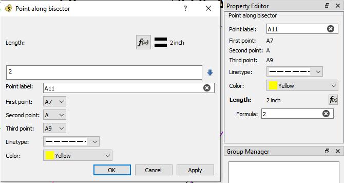
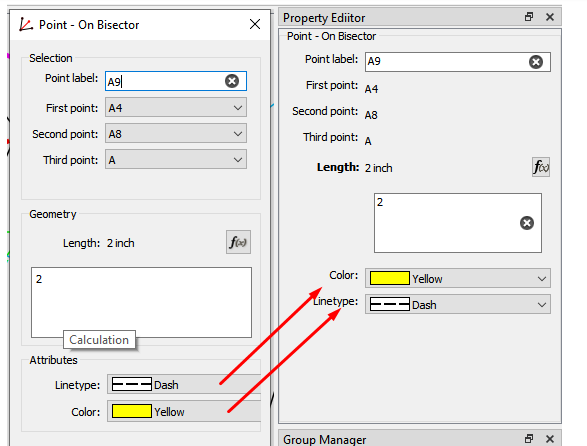
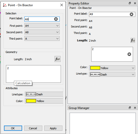
More of the same… onbidector_before

To note here… the term “along” is replaced with “On”… and the XML tooltype attribute tag will be "onBisectorLength - following < Point > - < On Bisector > < Length >.
onbidector_after

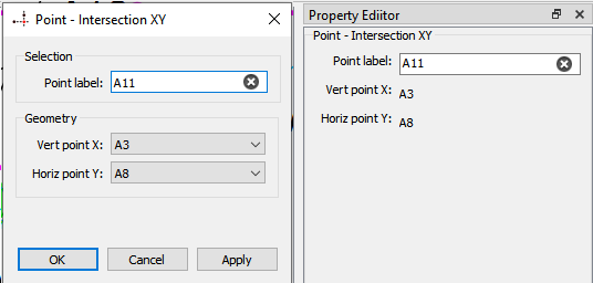
Self explanatory… intersectXY_before intersectXY_after

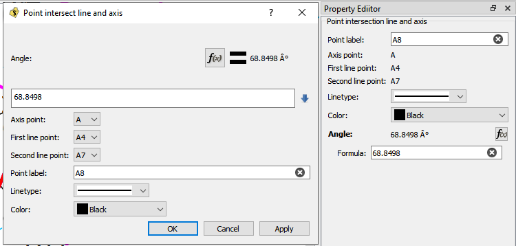
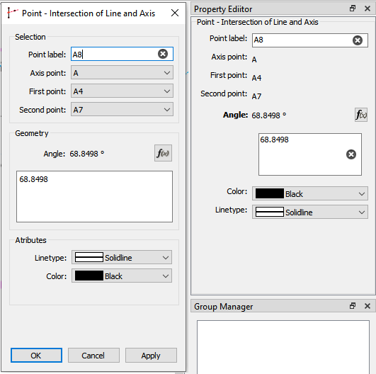
lineaxis_before lineaxis_after

Should be noted that in the XML this tool is referred to as height. Huh ??? Will eventually be renamed - my suggestion - “intersectLinePerpendicular” lineperp_before lineperp_after
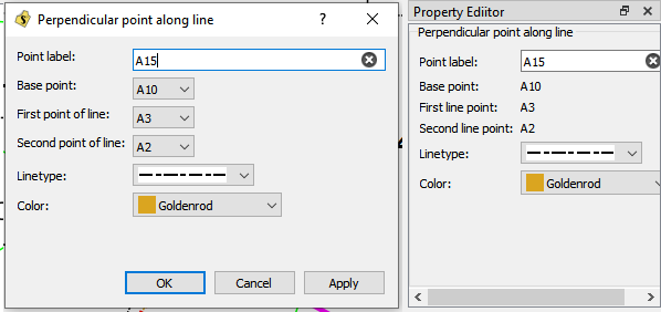
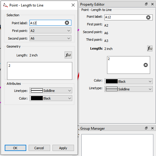
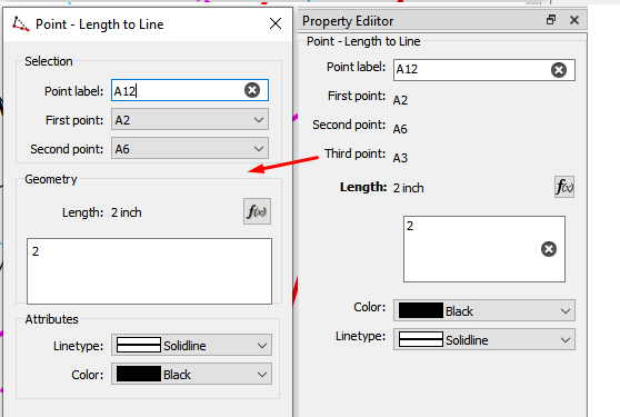
Ok… This one Susan suggested the change to “lengthToLine”. lengthtoline_before lengthtoline_after
Another misnamed tool… for one it does NOT produce a triangle. triangle_before
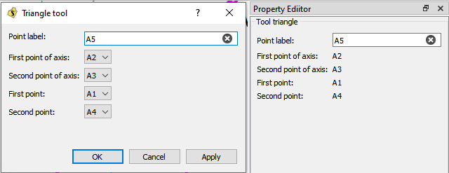
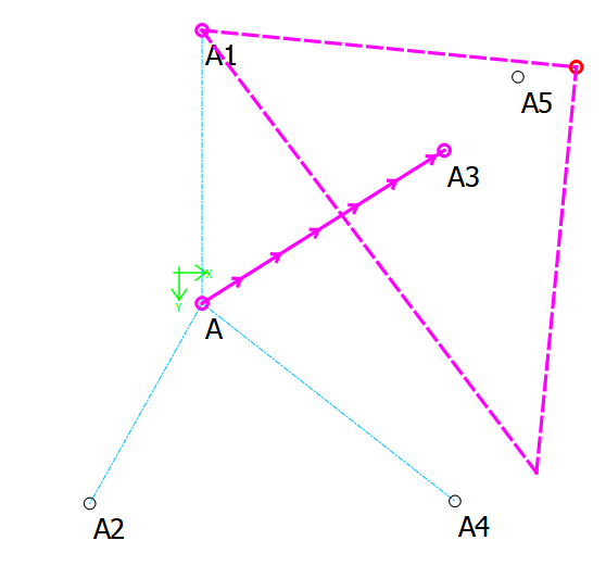
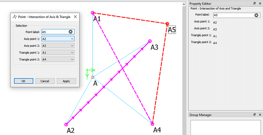
Susan suggested the XML tag “trianglePointOnAngle”, but this doesn’t follow the semantics of the other tool naming. I included an example of the tool to illustrate what it does… it produces a Point FROM the intersection of an Axis and the Sides of a right triangle. Again < Point > - < Intersection > < Axis & Triangle (sides) >. While the Angle of the hypotenuse is relevant, it is NOT directly provided by the user, and thus is NOT an input argument. I should also note that I changed the visual of the tool so the sides of the triangle are the maincolor (Red) in keeping with the normal visuals for the tool. The supportcolor (magenta) represents inputs the user provides, while the Red parts are the calculated result of those imputs.

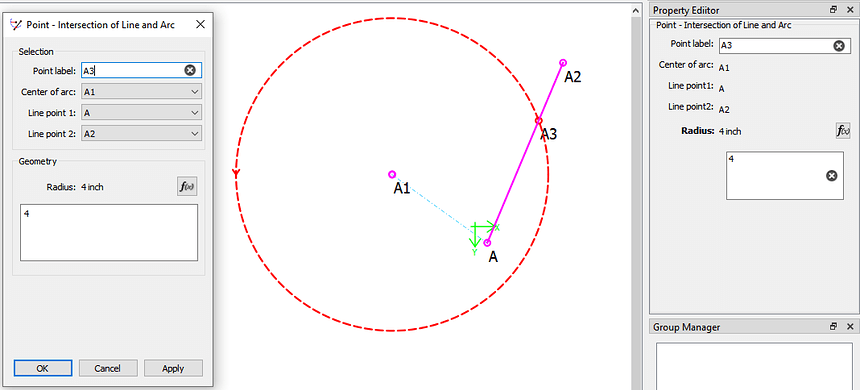
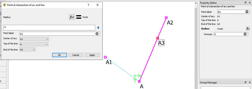
And the last Point tool… sort of. It’s the tool formerly know as “pointOfContact” or Intersection of Line and Arc.

Nothing major here, other than I fixed the display of the Arc.

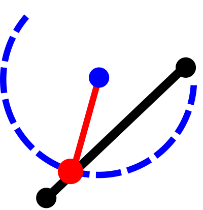
The sort of… Based on then discussion in another topic I updated the icon for the tool button to more accurately represent the tool operation… where the “black” dots represent selected points and the “red” line represents the arc radius. The red dot is the produced point.

point_intersectlinearc_icon@2x

and I moved the tool where it makes a little more sense… to the Arc tool group.
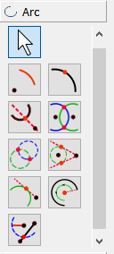
arctools

I should note that this tool could use some work in the future as there can be a possible two points of intersection, but currently the tool only selects the point closest to the first point of the line.
5 Likes

Is the Base Point editable from the property editor? image

And the formula box, can that not have a Collapse arrow, please?

image

Something like there?

image

And then some have an X to clear the formula’s while others don’t.

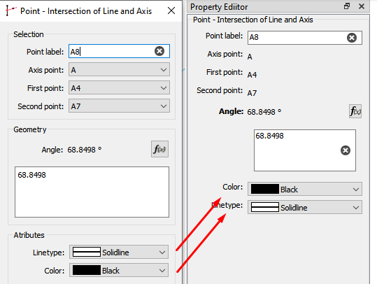
Just for appearances… Shouldn’t these be switched?

image

image

Missing 3rd point:

image

I’m totally lost on this one…

image

This is really looking good :slight_smile: Thank you very much :star_struck:

4 Likes

Thanks for your input Grace.

No. There are many tool properties that are not editable in the Property Editor… at this time. It will take a deeper dive into the Properties Editor to fix that, or my idea is to dump the "Properties Explorer " lib altogether, and utilize the widgets that are already present in the dialogs within the dock… so they would be exactly the same. Also this would make it easier to maintain code as a change in one form would reflect in either the dialog or dock - no need to maintain 2 systems to edit properties.

I’ll… ahem expand on this when I can post some illustrations to explain my reasons for eliminating the “grow” button.

Work in progress… the X only appears with a line edit box , not a plain text box. Just a note… the Property Editor is a 3rd party library RT dumped in the program, and it creates the dock widgets on the fly… and while somewhat flexible as to the type of proprty widgets that can be used, it is fairly rigid in the layout. Currently the dialogs use a plain text box, which allows for multiple lines of text and presents a scroll bar when needed. The Property editor does not have a plain text box, and can only use the single line edit box. I am trying to add a plain text property box, and replace the line edit “function” boxes to be like the dialogs.

[quote=“Grace, post:2, topic:5390”] Just for appearances… Shouldn’t these be switched? [/quote

Good catch. They probably are… many of the screenshots were taken over the past month, and I probably rearranged the color / lineType items, but didn’t snap a new screenshot. I’ll make a note to check them all to be sure. :slight_smile:

Oops. It’s there… just hidden in the group box… need to reset min height.

I was too… until I dug into it. It should be noted this tool creates the point at the triangle’s right angle vertex… not a triangle - as the current name suggests. This is one of those cases where settling for Intesection of Axis and Triangle is a compromise… as “Intersection of Axis and Sides of Right Triangle Based on Hypotenuse Angle” is just too long. In this tool you select 2 points of a line (which project an axis), and then select 2 points that represent the hypotenuse of a right triangle… the tool calculates the triangle so that the 2 sides and the axis intersect at the right angle vertex, based on the angle of the hypotenuse. This is a clear example of what the tool does, other inputs may produce something less clear. Currently the tool will display everything magenta… I switched the triangle sides to red, as you don’t select them. It might also be helpful if the visual also projected the axis past the selected line points, instead of the arrows just pointing to the vertex? That being said… not sure where this tool is useful in pattern making?

3 Likes

I used it to draft part of a circle-based face-mask. Unfortunately, I seem to have mislaid that draft, so I can’t check on if I decided there was a better way afterall. It may be on my other computer.

1 Like

That would be great if you can find and post the pattern. I always like to see what a specific tool can do. I’m just curious if this geometry is used in any particular pattern system, and thus the reason why it’s there… or is t just CAD tool thrown in?

1 Like

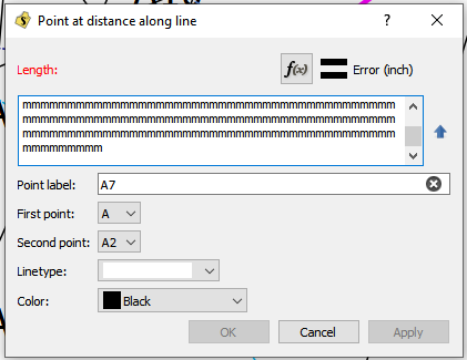
Not going to happen in the Property Editor… at least not how it’s currently implimented in the dialogs. Too much work for very little return. My take is had I implimented the expand / collapse to the edit box I would have subclassed the QPlainTextEdit widget to handle the expansion inside the widget class, and not having to do it inside every dialog class.

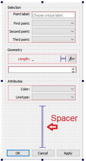
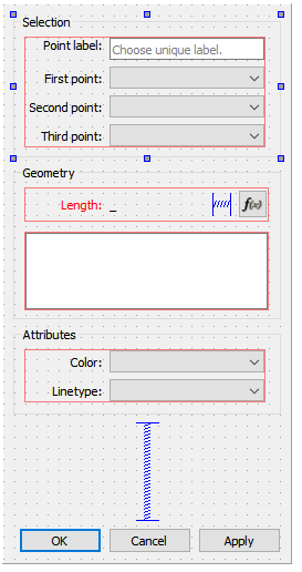
As implimented I see little use for the expand / collapse feature - other than maybe in the dialogs with 3 or more text edit boxes. Let me explain. To be able to expand a text box there needs to be “blank space” to expand into, and in terms of widgets it’s the spacer widget that acts to control the empty space by actling like a spring to allow another widget to expand, or collapse… as illustrated in the below snaps from the form editor

Collapsed

collapse

Expanded

expanded)

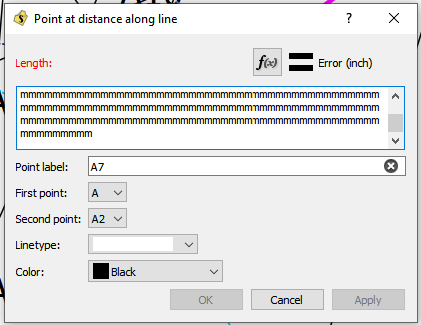
The dialog window is always the same size, so IMO there is nothing gained by expanding the text box, when you can just leave it at the expanded height. As in the snaps below…

Collapsed

noexpandbefore

Expanded

expand

Expanded with more horizontal space without the arrow button.

noexpand

Again… I see no purpose to the collapsed state of this dialog… unlike say with an expand / collpase feature in a file tree widget. That being said… if we really want the feature, I would rather reimpliment it in a subclassed widget, where it would make it easier to maintain or create new dialog forms without needing to add a “grow” button & code. I would have it expand upon gaining focus (clicking on the edit box) and collapsing when it looses focus (< Return> or clicking elsewhere).

2 Likes

Yeah, I was wondering the same thing…i don’t think I have ever needed anything like that in garment drafting, but perhpas it has an application elsewhere.

1 Like

May I ask for confirmation on this compared to intersection of arc and axis? Am i correct in that this function gives a point where an existing line crosses an arc, and the other tool gives a point on the arc based on a line/axis created from a chosen point?

3 Likes

Ahhh… Thanks for the explanation :slight_smile:

:slight_smile: I’ll have to do some digging into it, too. It’s not something I’ve had a use for as I normally use intersecting arcs to get any triangle going :rofl: My trig & alg stopped in grade 7, so didn’t reach that far. :grin: So I kinda keep it simple with lots of nodes & lines.

Yes, I didn’t realise it was such a big thing :cry: Sorry that I mentioned it, it’s really not important enough to bother with it at this point while there are more important things happening :slight_smile:

Possibly. This tool places a point at the intersection where an imaginary arc crosses between two existing points, whereas in intersection of arc & axis it’s the line which is imaginary.

:unicorn:

1 Like

Yes, and yes. Generally you can think of a line as providing 2 points, and an axis a one point and and angle. In some tool cases though, a point may be created from extending a line as if it were an axis.

While the tools would seem to do the same thing… such as in some cases you could just use the axis / arc tool instead of the line / arc tool - with the line / arc tool it may incorporate changes of the line’s angle, where as the axis will remain at what ever angle you set.

2 Likes

Technically the tool should not find a point if it doesn’t fall on the line and arc segment… I’ll have to check - it may treat the arc as a circle. Also like I mentioned the tool will only take the intersection nearest the 1st line point - in the case where there may be 2 intersection points. We can probably fix that in th he future. Would require a change in the schema.

2 Likes

I did a little checking, and there may be a real simple solution to install an event filter to catch the Focus In and Out (or even Hover) events to automatically expand and collapse the text edit box… which would also work in the Properties Editor. Could also make it a preference to enable the expand/ collapse. :slight_smile:

2 Likes

Bravo :+1: :+1: :+1: :+1:

1 Like

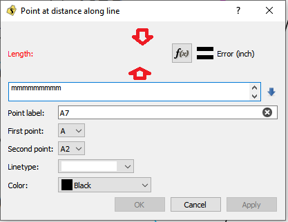
Ok… check this out I fiddled around with the plaintextedit box and was able to “automagically” have it expand when it gains focus, and colapse when it looses focus.

The only issue I have the way implimented, is that if you use the right mouse button context menu, the box looses focus and collapses… and it kinda defeats the use of the “Copy” item.

So… the question is… I can disable the context menu for the plaintextedit boxes in the dialogs - which means you loose the option to “copy” from the text box? OR I can subclass the QPlainTextEdit box - like I would have if I included a “grow” arrow button - and handle the focusout event to ignore the collapse if a popup context menu triggered it?

BTW… thanks to Grace… who’s push for the expanding / collapsing text edit, lead me to finally understand a missing piece in how the layouts interact with all the widgets on a form - or in this case dialogs. There’s kinda of a few tricks to nest or un nest widgets & layouts to get them to dynamically expand together … and I learned that one I was missing, :slight_smile:

2 Likes

You did the fabulous work, now I have two suggestions :laughing: :thinking:

Could all sides of the Triangle be Red and leave the Axis as Purple? This color choice would visually show the meaning of this tool.

  1. Change Intersection of to Intersect.
    Example: Intersection of Axis and Triangle would change to Intersect Axis and Triangle.

  2. Change Length To Line to Lengthen Line, it’s easier to understand. Yeah I know I made that suggestion… there’s always room to improve. :slight_smile:

  3. Change the Icon for Intersection of Line and Arc (‘’‘Intersect Line and Arc’‘’) so that a green radius goes from green arc center to the red dot on the circle

  4. Update Intersect Line and Arc icon colors to represent the three distinct objects involved: Arc is Blue, Line is Black, radius with it’s intersection as Red bitmap

@Douglas your work is perfection, I make these suggestions with humility and a million tons of respect.

2 Likes

Easy peasy. Done.

Rest of suggestions…

So basically we can remove the “Intersection of” of any of the tools and just replace it with “Intersect”. Works for me as it saves horizonatal text space.

Lengthen Line… Agreed. I have a spreadsheet roadmap of all the tools and the new & old naming which I’ll post in the other gui naming topic before dropping a PR for this update… just so we can agree on any new new schema tag names, tool names or titles and without having to change them again.

Intersect Line and Arc icon… Yes… I like the showing the radius intersection with the line and point. Makes it just that much clearer.

Aw shucks. I’m just one cog… I openly appreciate the input from others.

1 Like

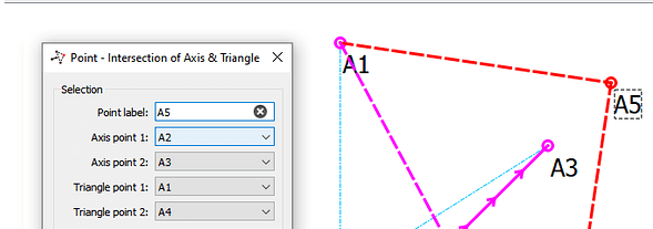
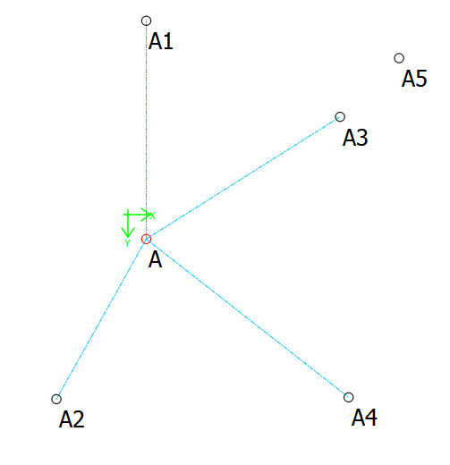
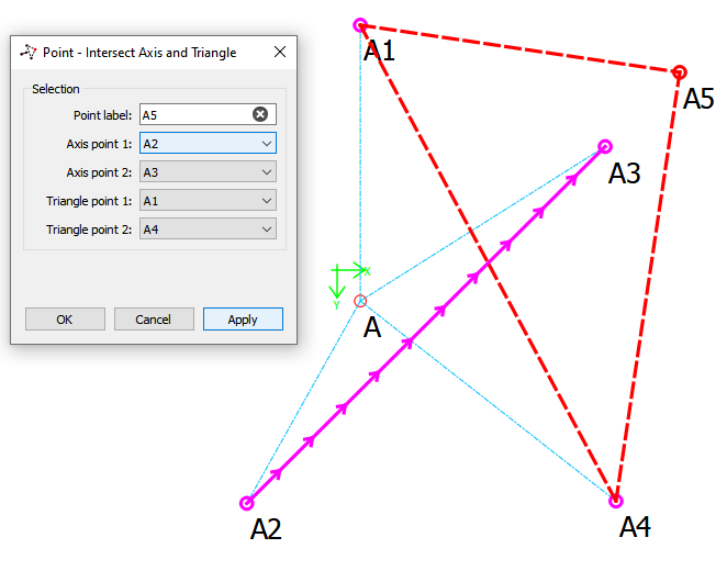
Updated Intersect Axis and Triangle tool… Just a note - to those that are curious about the display of tools. There are 3 parts to the display of a tool… that which is left on the screen as per the selction, geometry & color & lineType - which is handeled in the tool class.

triangle.val (1.3 KB)

This tool only leaves a point… in this case A5: triangle0

The interactive display as you move the mouse a round selecting points,

triangleinteract

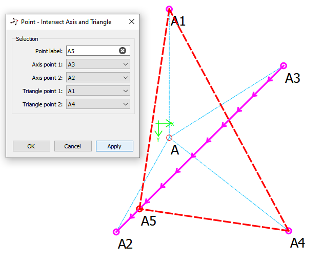
And the visual display when you click on a tool (object) - both of which are handled in the tool’s (point A5) visual class. Here’s the Dialog title change and the visual with the triange all red:

triangle1

And the result if we flip the axis points:

triangle2

It should be noted that I believe this is only tool that the (line) axis shows a direction - indicated by the (many) arrows. Also note that the tool will extend the line as an axis to satisfy the intersection point - as illustrated in the 1st example.

3 Likes

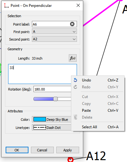
BINGO. Subclassed the QPlainTextEdit to automagically expand on FocusIn and collapse on FocusOut - except when the context menu pops up. Allows one to still use the Cut, Copy, Paste & Delete items. This way also provides a bit more control over which QPlainTextEdit boxes are promoted, rather than globally affecting all the dialog QPlainTextEdit boxes. Just need to add a pref to enable / disable the behavior… and go back and fix all the dialogs.

expandingtextedit

2 Likes