Oh, wow! You’re a star!!! Thank you. 


Make that a gold star… LOL Figured out how to add dummy Text properties to simulate the Dialog GroupBox titles. Putting the properties in a real groupbox with the box frame around it’s items would take some more reworking in the way the widget content is built, but I think this is close enough. 
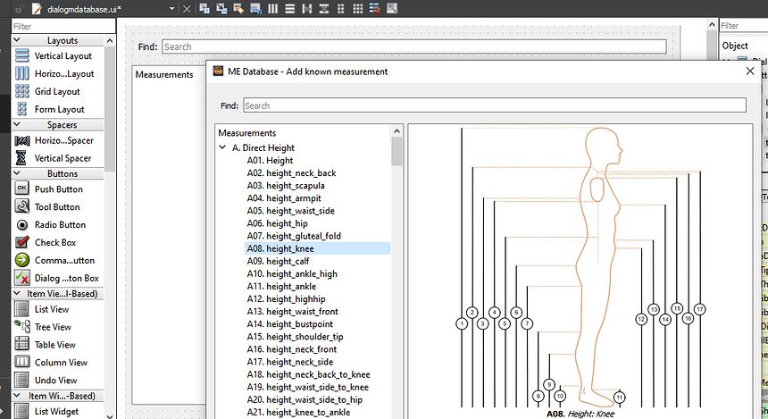
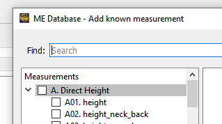
So now I have a question in regards to the ME Database dialog when selected via the measurements->Database menu. Currently it is set as a “non modal” dialog - meaning it opens on it’s own, and does not always have to appear on top of the main SeamlyMe window. The issue is it’s easy to lose the Dialog behind other app windows - as shown in the screencap where I’ve got it on top of the Creator window. I believe I could set a flag to keep it on top of the SeamlyME window. The window also stays open even if you close SeamlyME.
Questions are… does anyone see a need for the dialog to be non modal? If so, should it be kept on top of the SeamlyMe window? Or for that matter is there a need to have Measurements->Database at all… which is simply showing the known measurements that you can just view by using Add Known?
I think we’ve discussed this before, but my take is the only purpose the show database dialog serves is if you wanted to be able to view the database on top of another app - like a text editor or spreadsheet, but even that is limited because you can’t interact with the database and other apps (like cut&paste or drag&drop), and it will lose focus and go to the back as soon as you click off of it.
Thoughts?
Hmmm… Yes… I have certain programs open while I’m working, too, like Whatsapp and it’s most annoying when you need to reply to someone on WA when you have a screen in front of you that you don’t want to close and if you move the screen out of the way, then it closes the WA & opens SeamlyMe or 2D - the same thing happens when you’re working in History.
I’d vote for having it only in front in the program its attached to.
That would be my thought. Since you can’t interact with the window contents it defeats the purpose of being non modal AND not on top. I could make it stay on top, still be non modal, but also add the minimize / maximize buttons? That way you could keep the dialog open, but minimize it out of the way? I would think too there should be some window settings to force it to close upon closing the app.
Oh, yes, definitely 
I… don’t remember ever using the Database window before. It does seem kinda redundant in the worst way, especially considering that it has the exact same window-dressing as Add known. On the plus side it would keep one from accidentally altering a file if only looking the options up for tech-support type purposes?
Another thought is that it could be intended to be able to add a custom measurement template to your Known measurements list, (& just be woefully undeveloped.)
¢¢
![]()
Only difference in the database dialog (vs the add known dialog) - is you can’t do anything with it but look. Personally if it were my own fork, I’d just delete that menu item, but I’m always hesitant to remove any feature unless it really makes no sense to keep it - lest it affects some user’s work flow in a negative manner. I also don’t like to add some feature just because I can or it will look “cool”. I’m a minimalist, “form follows function”, KISS (keep it simple sandy) kind of guy. ![]()
Yeah… you would think by the menu item name Database that you would be able to interact / manage the Database. At ;least it would make a little more sense if the item read View database.
That being said… I think the “known” list of measurements needs to be maintained as a standard set that’s the same for everyone. At least in terms of patterns that would be shared. For ex… it would make no sense if I were able to add my own objects to the DXF spec as other users and apps would not be able to use it. I would think that’s the whole idea of having a version controlled set of standard “known” measurements.
Fixed another minor issue with the Me Database dialog window title… “Add known measurement” now only appears when Add New is selected and not when the view only Measurements->Database is selected.
![]()
![]()
![]() I can’t even remember looking at it. Just shows how insignificant it’s been in my Seamly life. If I want to see the database, I open the 'Add Known". I probably glanced at when I was doing the manual, back in 2017, & dismissed it as totally useless after mentioning it in the manual.
I can’t even remember looking at it. Just shows how insignificant it’s been in my Seamly life. If I want to see the database, I open the 'Add Known". I probably glanced at when I was doing the manual, back in 2017, & dismissed it as totally useless after mentioning it in the manual.
& I also go for the KISS. No point in getting all wound up in unnecessary threads.
I have a better solution… keep the “show” Database dialog option, but put it in a “View” menu… along with the toggle Diagrams - where they belong.
I know it’s been awhile… besides being busy with the movie job, I’ve had to deal with my 99 year old mother who broke her hip, the nursing home, insurance, a Medicaid lawyer, digging up all kinds of documents and financials, etc… but after 3 days of resolving the conflicts from pulling the changes in the current and the branch for this issue - I finally got the app to compile. Just need to review the keybpard shortcuts for some of the tools, as some of the names have changed , and give it a good looking over to see if I missed anything - then I’ll push the changes.
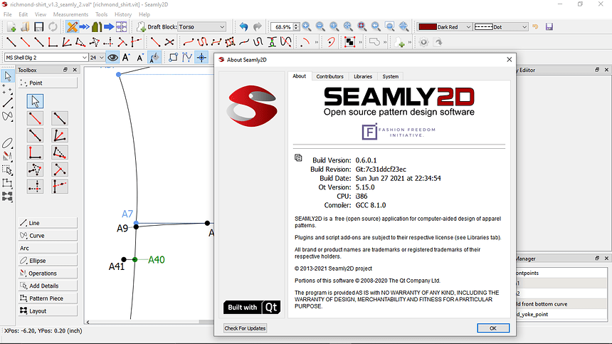
BTW… in the process of updating the dialogs I was finally able to recover most of the work I did on the Help->About dialogs - so the copy to clipboard" of the build info will also be in this build.
Been going through all the (updated) tool names, menu items, Dialog window titles, Property Manager titles, tooltips… cut some more superfluous text… and updated some of the keyboard shortcuts - which required jotting down notes to avoid shortcut conflicts. In the process I decided I might as well add this:
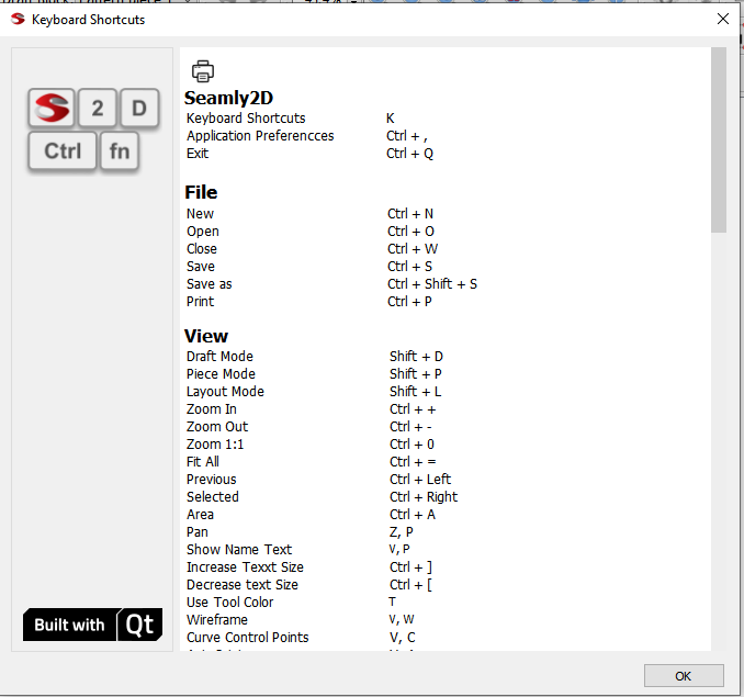
Even added a “print” pushbutton so you can print out the list.
Cool!
I will note that the Mac users will be using the ⌘(unicode 2318, HTML ⌘) key instead of Ctrl.
Qt should map the Ctrl modifier to the command key on Mac Os.
Ok 3rd time is a charm right?
I’ve been busy redoing the Dialogs & Properties editor yet again - with the 2nd updates idly sitting on a crashed little blue hard drive… ![]()
This time around the updates to the Dialogs & Editor include a “current” pen with the addition of line weights. I won’t post all the dialogs… just the ones of most interest - IE the ones that were really wonky before.
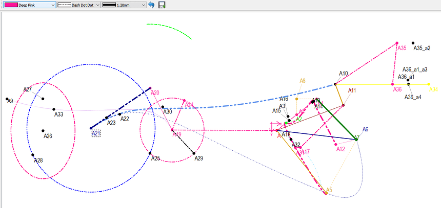
So here’s the Pen Toolbar and my ALL tools test mess. ![]() The toolbar is initialized with the (last saved) default settings. So you can change the pen settings, where now every new tool defaults to the current pen - so you don’t have to edit EVERY single new tool. The reset button resets back to last saved Pen, and of course the Save button allows you to save the current Pen as the default (preset). Future additions will include loading presets, so we can have semantically defined preset pens. Yet to be determined is whether that means a set of standard pens, user defined pens, or a combination of both.
The toolbar is initialized with the (last saved) default settings. So you can change the pen settings, where now every new tool defaults to the current pen - so you don’t have to edit EVERY single new tool. The reset button resets back to last saved Pen, and of course the Save button allows you to save the current Pen as the default (preset). Future additions will include loading presets, so we can have semantically defined preset pens. Yet to be determined is whether that means a set of standard pens, user defined pens, or a combination of both.
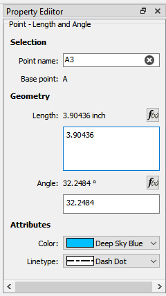
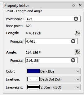
I also cleaned up the Prop Editor, so it too can edit the lineWeight… as well as a few missing Properties in some tools - the Elliptical Arc comes to mind missing the lineType. We will also be able to edit Points - which is what I’m working on now… but the Editor should more closely resemble the Dialogs now - including matching the property order top to bottom - Selection (with the Point or Curve name right at the very top!) , Geometry, and Attributes.
This one is probably the most egregious examples of how NOT to design a dialog. Besides taking up almost 1/2 the dialog(and a bunch of code to handle it) I have no idea what 's with the arrows. Also gone are the usual suspects - the old logo, the GIANT = icon (note to self - delete this from the resources) , and the do nothing ?.
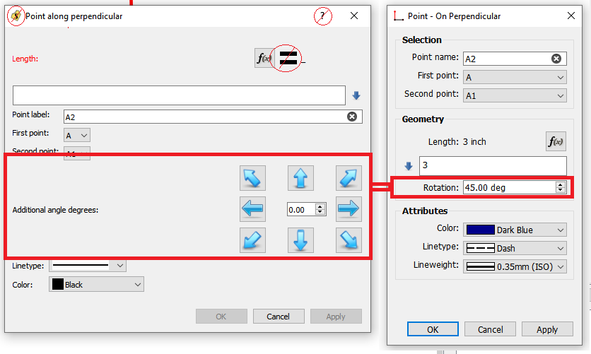
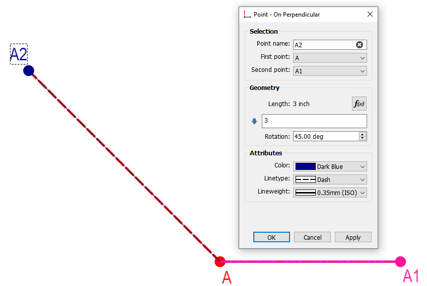
All that to enter an angle. So here’s the dialog in use… with the rotation being how much the Perpendicular is (CC) rotated… and clicking the up / dn spinbox arrows increments by 45 degs. Could have made this more ganular with a single step of 1 or 0.1 … but if you’re going to do that you might as well just type the angle in. The rotation rollover tooltip displays the existing angle info of 0-360 counterclockwise, etc with noting that the angle is added to the angle of the Perpendicular. BTW… this now matches the Prop Editor, as the whole arrow widget thingy couldn’t easily be done in the Editor without a whole new custom Property class.
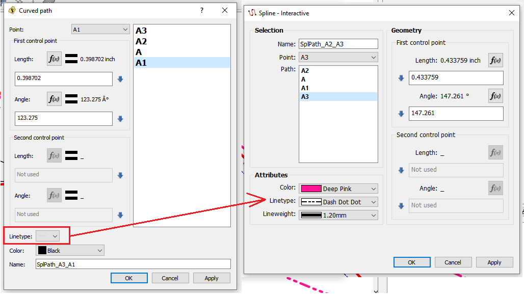
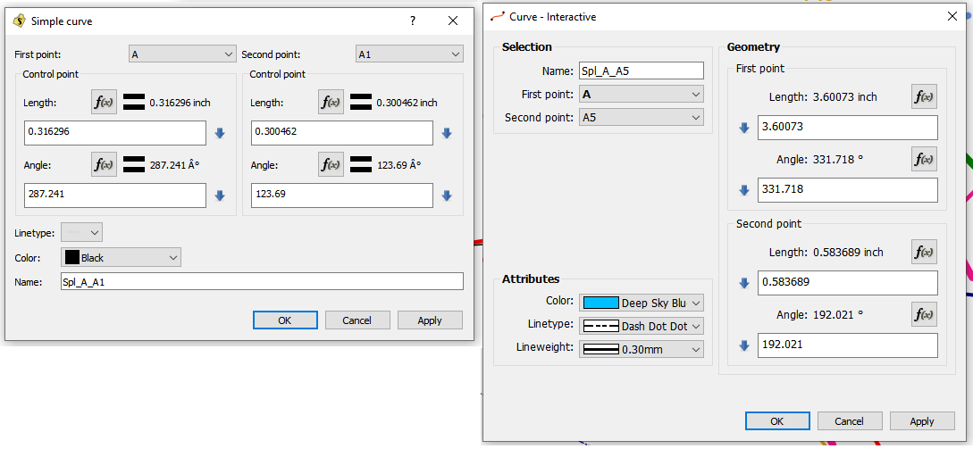
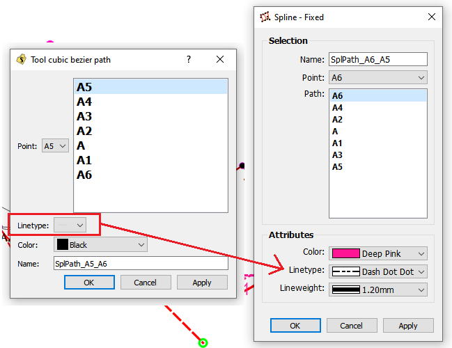
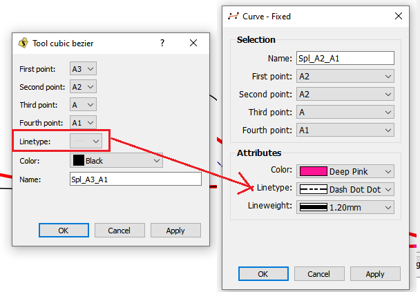
The curves & splines are probably the ones that got reorganized / fixed the most… fixed is the lineType in all of them. Some may note the change in the curve tool name format… there’s now Curve, Spline (which is more or less multiple consecutive curves), and whether the control points are fixed or interactively movable. BTW… I think we need a tooltip to note that in the Spline tools- highlighting a point in the path, and then selecting a (new?) point in the dropdown, changes the point in the path. Currently the path doesn’t immediately update, and it may be confusing to new users.
![]() Thank you very much, @Douglas
Thank you very much, @Douglas
Ah. That’s what it does. I thought it looked like the thing to use if you had a known length and starting point, and wanted to place a point on an existing line. I wondered if it was a bug. Now to figure out how to achieve the above ![]()
Edit: Found it thanks to this thread Help: Create angled line point intersecting line, w/known length
Hello and welcome to the Seamly2D forum, @persistent
I’m so glad that this post helped to give you some clarity on the tools ![]()
Please don’t hesitate to ask us, if you’re unsure of anything. We’re always very happy to help.
